flowchart TD

A(Exploratory)
A --> B(1. Overview)
A --> C(2. Geospatial Intensity)
A --> D(3. Geospatial Exploration)
A --> E(4. Trends)
A --> F(5. Distributions)
A --> G(6. Network Relationships)
A --> H(7. Incident Summary)
Take-home Exercise 4 - Part 3
Decoding Chaos: Storyboard for Exploratory tab
1. Overview
Note: This is a continuation of the take-home exercise 4.
This assignment is separated into three segments (web pages):
- Initial Data Exploratory Analysis (IDEA) – Click here for IDEA page.
- Geospatial Data Exploratory Analysis (GDEA) – Click here for GDEA page.
- Prototype: Exploratory – Current Page
2. Storyboard
Storyboard aims to visually maps out user’s experience. It is a tool for making strong visual connection between the insights uncovered based on research and user’s interaction with the R Shiny dashboard application. The interactive components and UI design aims to facilitate data (and geospatial) exploration and analysis for users to develop effective counter measures and strategies.
The “Exploratory” dashboard can be broadly classify into two key areas:
Geospatial Data Exploratory Analysis allows users to select different variables and perform spatial exploration on the dataset to conceptualise armed conflict spaces in Myanmar.
Data Exploratory Analysis allows users to select different variables and perform initial exploration on the dataset to discover distribution, trends and network relationships of armed conflicts in Myanmar.
The proposed layouts and UI features for “Exploratory” have been conceptualised into seven sections as follows:
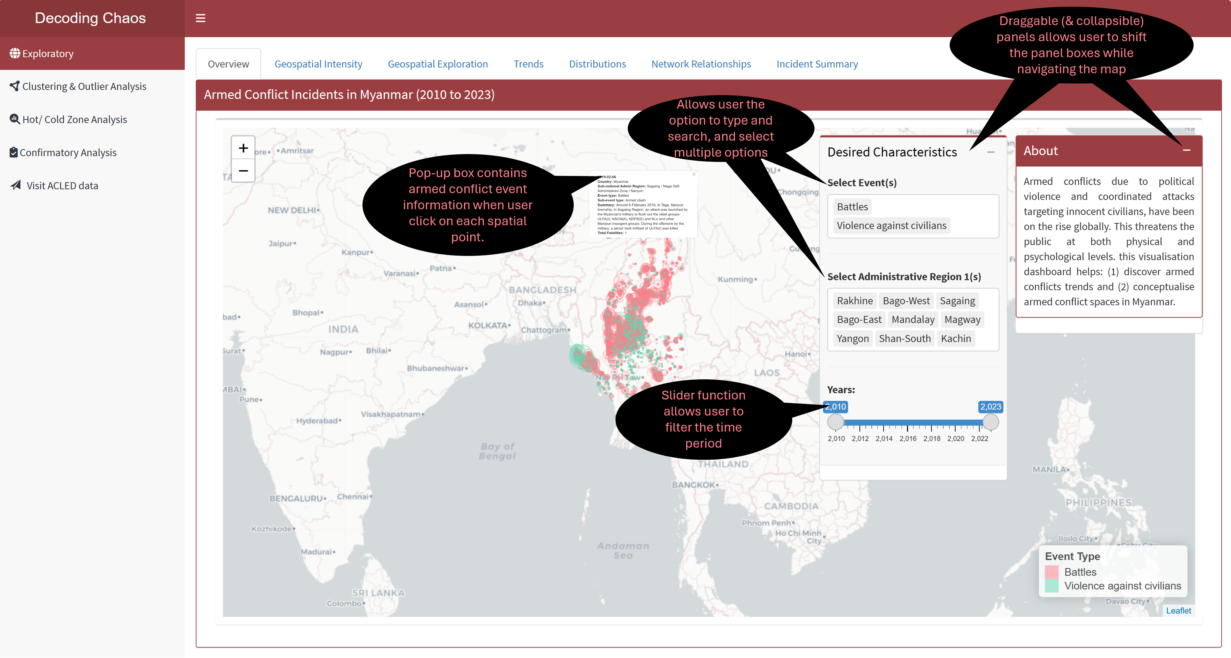
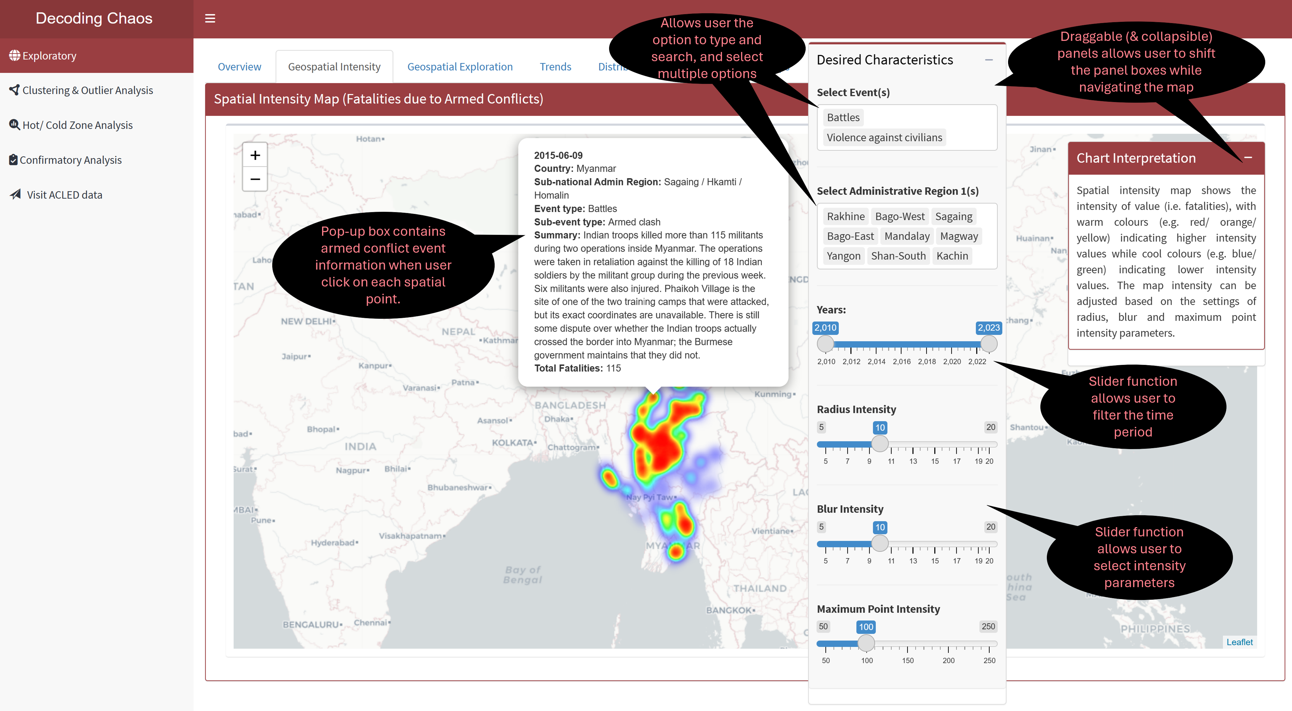
For enhanced user experience, the prototype included ‘filter’ components (i.e. desired characteristics) and ‘chart interpretation’ boxes, and have aligned them mainly to the right side of the web pages. This was intentionally set in that way to separate the main sidebar. The ‘chart interpretation’ box provides brief explanation of how each chart can be interpreted.
Section One - Overview
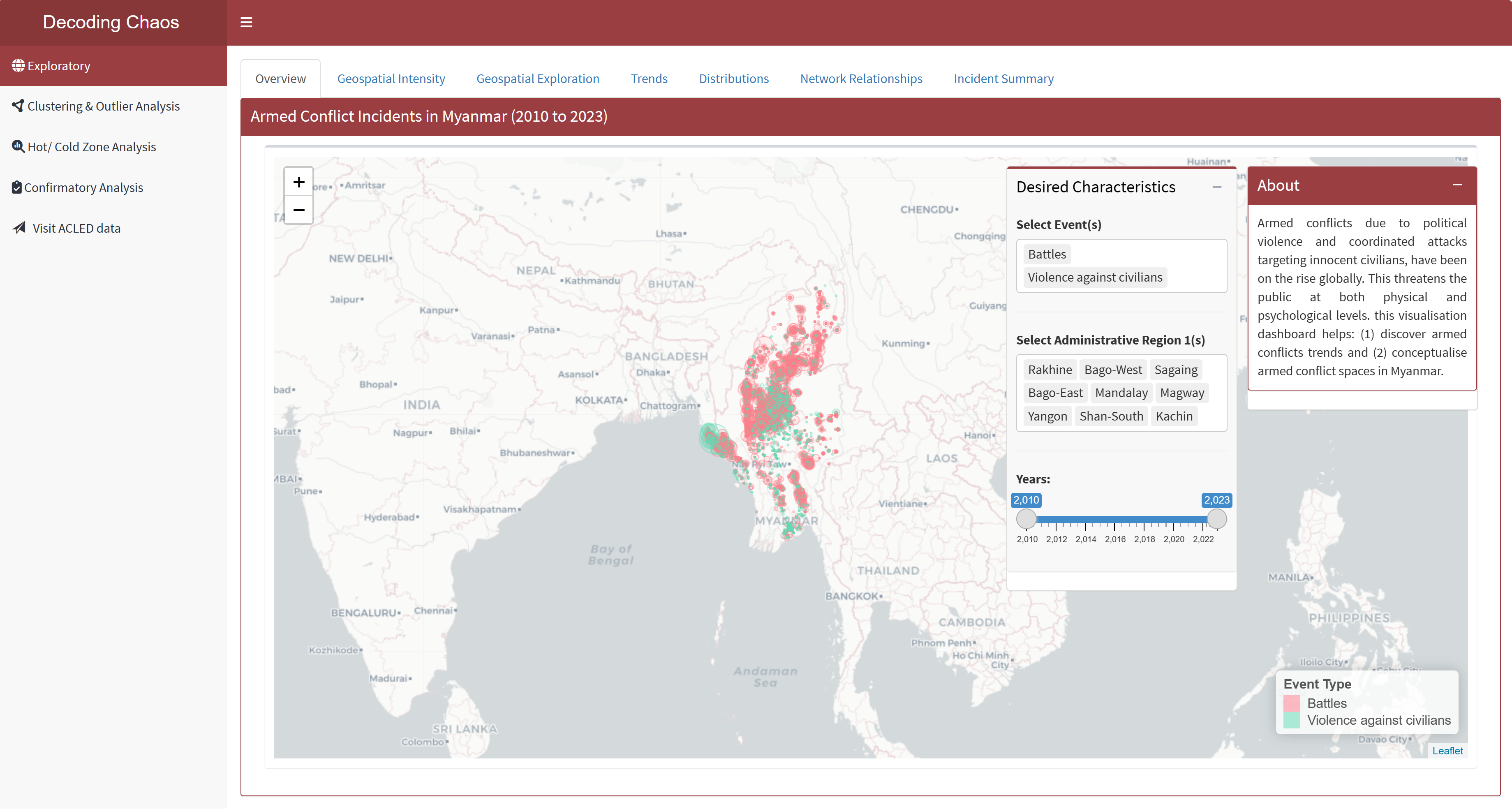
This tab serves as the “landing page” that displays the map of Myanmar and its spatial points of armed conflicts over the years (i.e. 2010 to 2023). Figure below shows the UI interactive features in the Overview sub-tab.
Code chunk below shows the simplified version of UI and Server components in R Shiny application for Overview sub-tab.
Show code
# UI Components
ExploreOverviewrow1 <-  fluidRow(
  leafletOutput(), # display point spatial map
  selectizeInput(), # select event (allows multiple selection)
  selectizeInput(), # select administrative region (allows multiple selection)
  sliderInput() # select year range
)

# Server Components
output1 <- renderLeaflet({}) # point spatial map
Section Two - Spatial Intensity
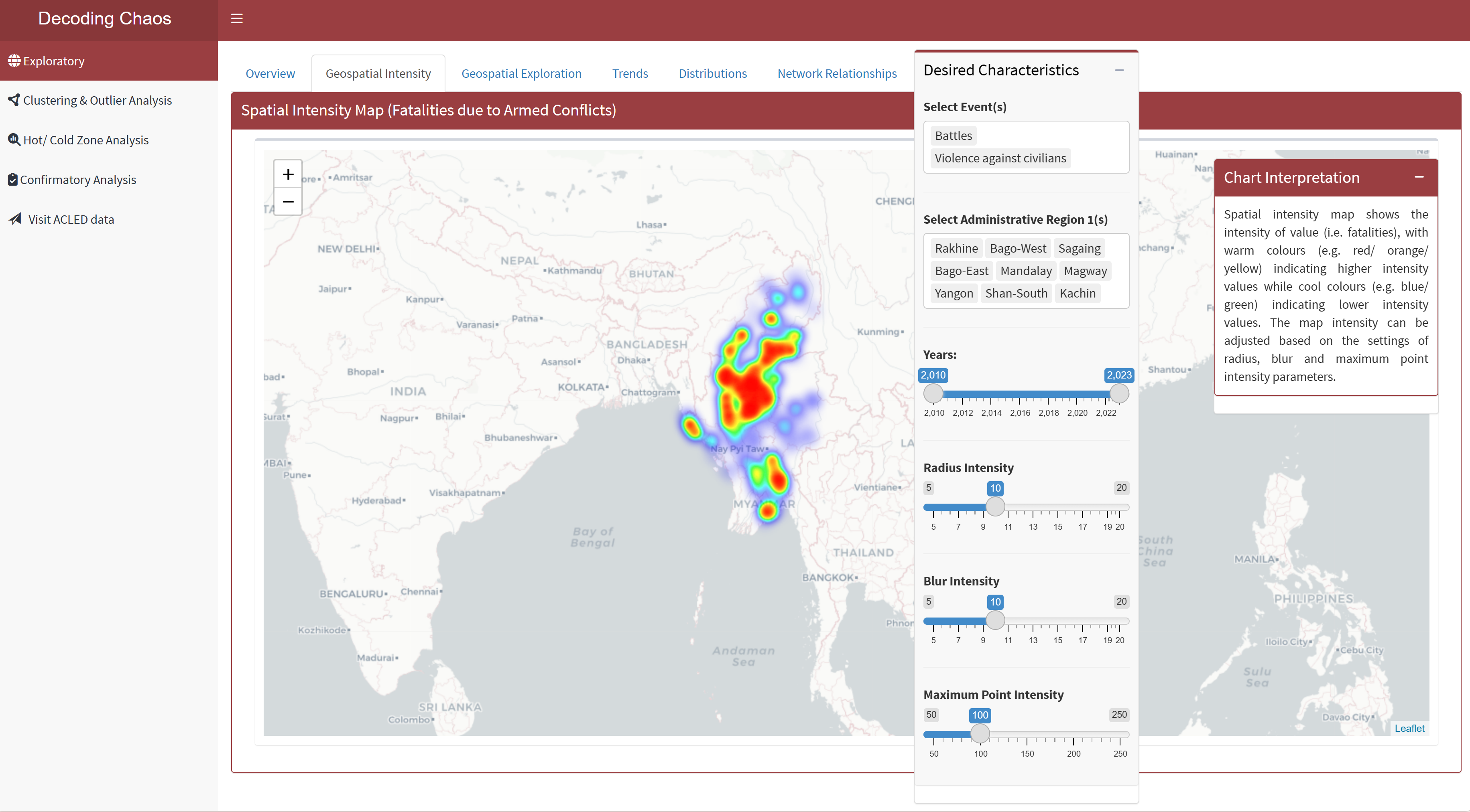
This tab displays the spatial intensity map based on the intensity of fatalities at each armed conflict incident. Warm colours (e.g. red/ orange/ yellow) indicates higher intensity values while cool colours (e.g. blue/ green) indicates lower intensity values. Users would be able to make use of this map to adjust the intensity parameters (i.e. radius, blur and maximum point intensity) based on the filter options. Figure below shows the UI interactive features in the Spatial Intensity sub-tab.
Code chunk below shows the simplified version of UI and Server components in R Shiny application for Spatial Intensity sub-tab.
Show code
# UI Components
ExploreIntensityrow1 <-  fluidRow(
  leafletOutput(), # display point spatial map
  selectizeInput(), # select event (allows multiple selection)
  selectizeInput(), # select administrative region (allows multiple selection)
  sliderInput(), # select year range
  sliderInput(), # select radius intensity
  sliderInput(), # select blur intensity
  sliderInput(), # select max point intensity
)

# Server Components
output2 <- renderLeaflet({}) # point spatial intensity map
Section Three - Geospatial Exploration
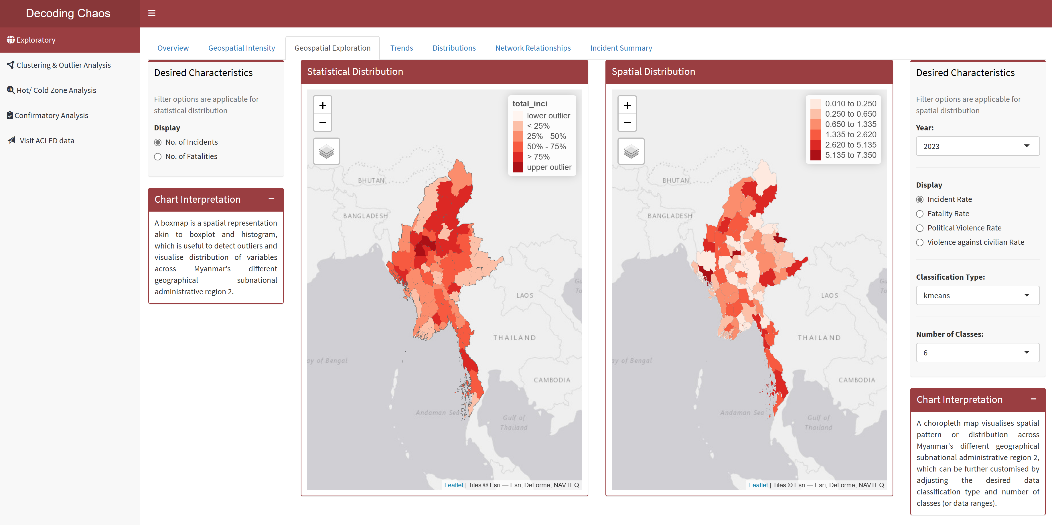
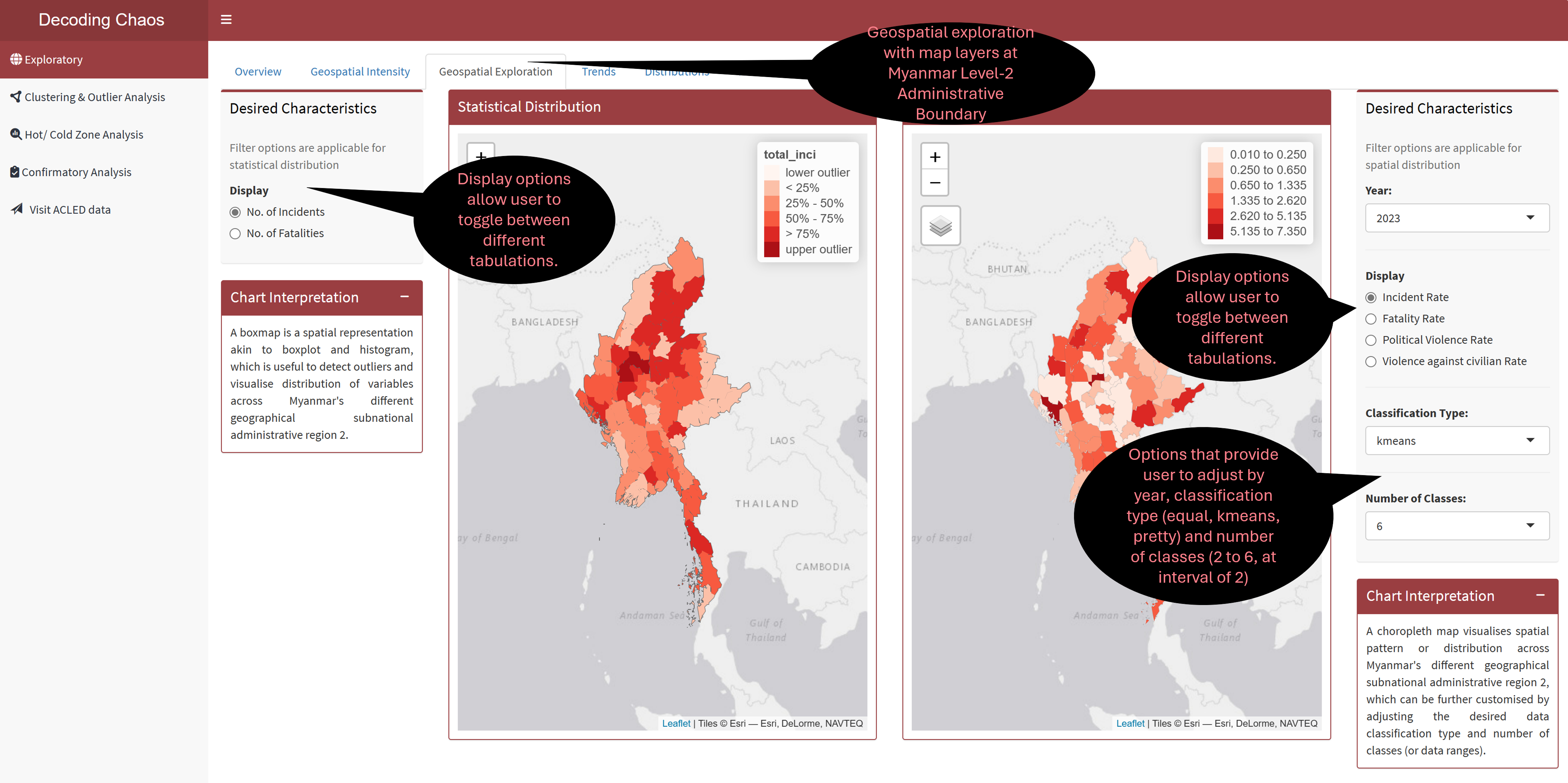
This tab displays two geospatial exploration maps (i.e. statistical distribution and spatial distribution). For statistical distribution map, it is a boxmap that displays the spatial representation that is similar to boxplot and histogram, which is useful to detect outliers and visualise distribution of variables. For spatial distribution map visualises spatial pattern or distribution across different geographical subnational administrative regions by plotting choropleth map.
Each map has its own different filter options that serve their different purposes. Users would be able to select different display variables and perform spatial exploration to conceptualise armed conflict spaces in Myanmar accordingly. Figure below shows the UI interactive features in the Geospatial Exploration sub-tab.
Code chunk below shows the simplified version of UI and Server components in R Shiny application for Geospatial Exploration sub-tab.
Show code
# UI Components
ExploreGeospatialrow1 <-  fluidRow(
  radioButtons(), # display radio button options
  tmapOutput(), # display statistical distribution map
  tmapOutput(), # display spatial distribution map
  selectInput(), # dropdown box selection for year
  radioButtons(), # display radio button options
  selectInput(), # dropbox selection for classification types
  selectInput() # dropbox selection for number of classes
)

# Server Components
output3.1 <- renderTmap({}) # statistical distribution map
output3.2 <- renderTmap({}) # spatial distribution map
Section Four - Trends
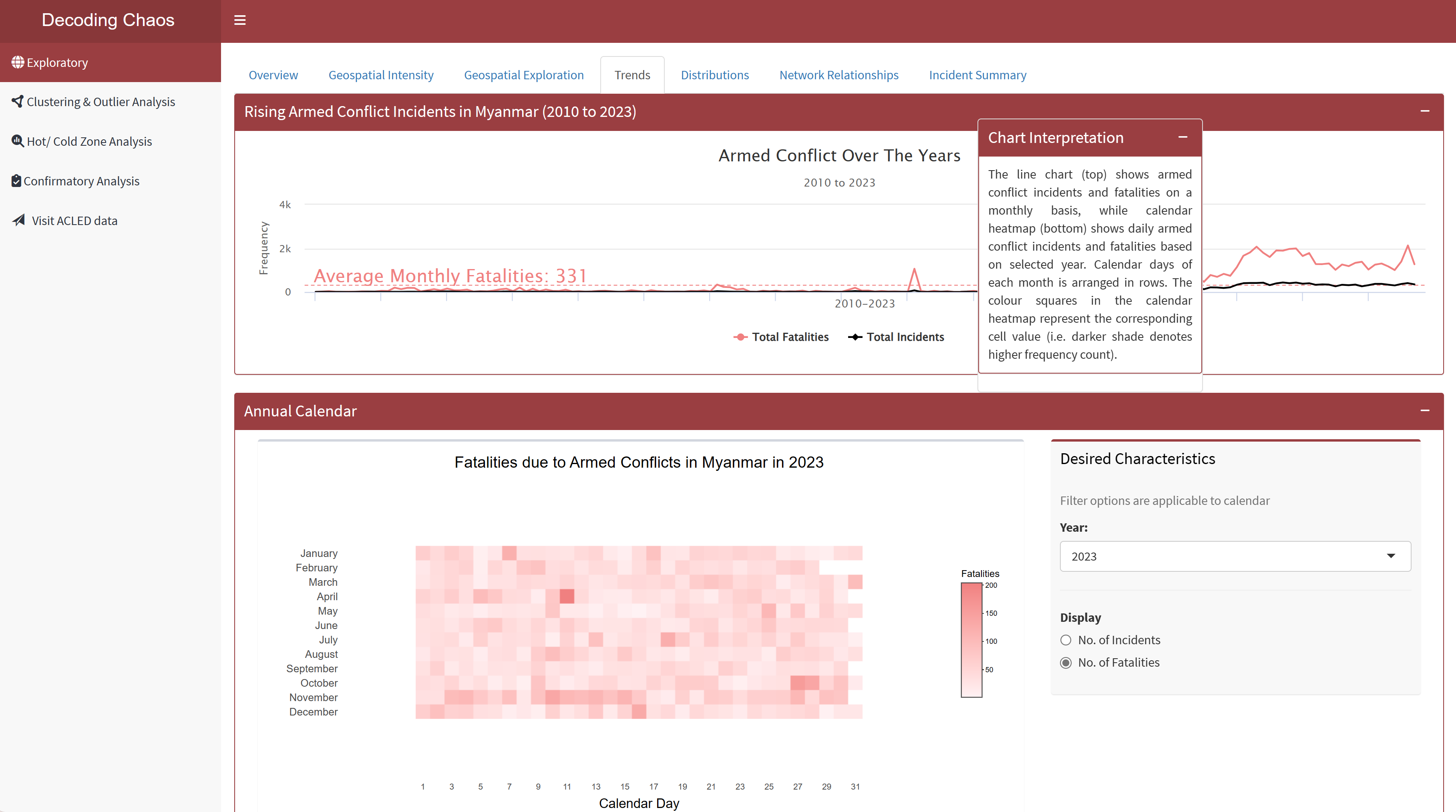
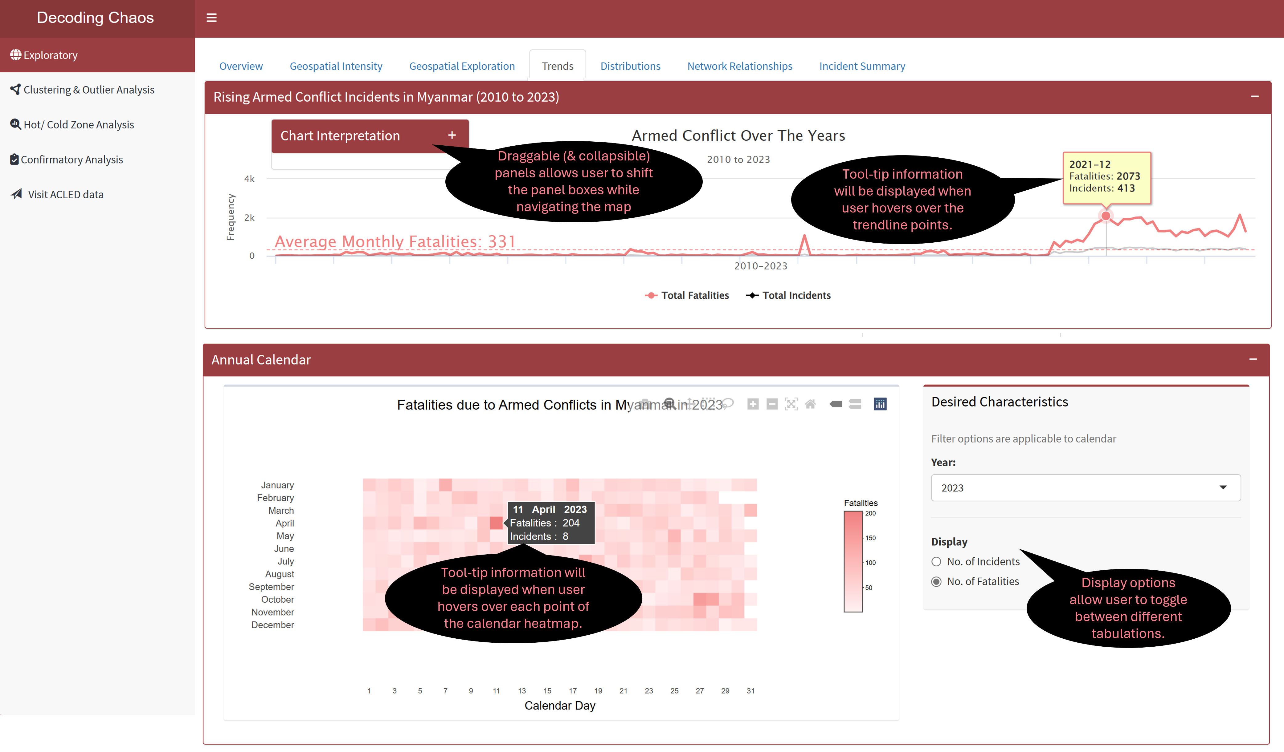
This tab allows user to perform time series analysis to identify trends, or cyclic patterns, spot anomalies, visualise distribution of armed conflict incidents/ fatalities and how it has changed over the years using either line chart or calendar heatmap. The line chart (top) shows armed conflict incidents and fatalities on a monthly basis, while calendar heatmap (bottom) shows daily armed conflict incidents and fatalities based on selected year. Calendar days of each month is arranged in rows. The colour squares in the calendar heatmap represent the corresponding cell value (i.e. darker shade denotes higher frequency count). Figure below shows the UI interactive features in the Trends sub-tab.
Code chunk below shows the simplified version of UI and Server components in R Shiny application for Trends sub-tab.
Show code
# UI Components
ExploreTrendrow1 <-  fluidRow(
  highchartOutput(), # display line chart
)


ExploreTrendrow2 <-  fluidRow(
  plotlyOutput(), # display calendar heatmap
  selectInput(), # dropdown box selection for year
  radioButtons() # display radio button options
)


# Server Components
output4.1 <- renderPlotly({}) # line chart
output4.2 <- renderPlotly({}) # calendar heatmap
Section Five - Distributions
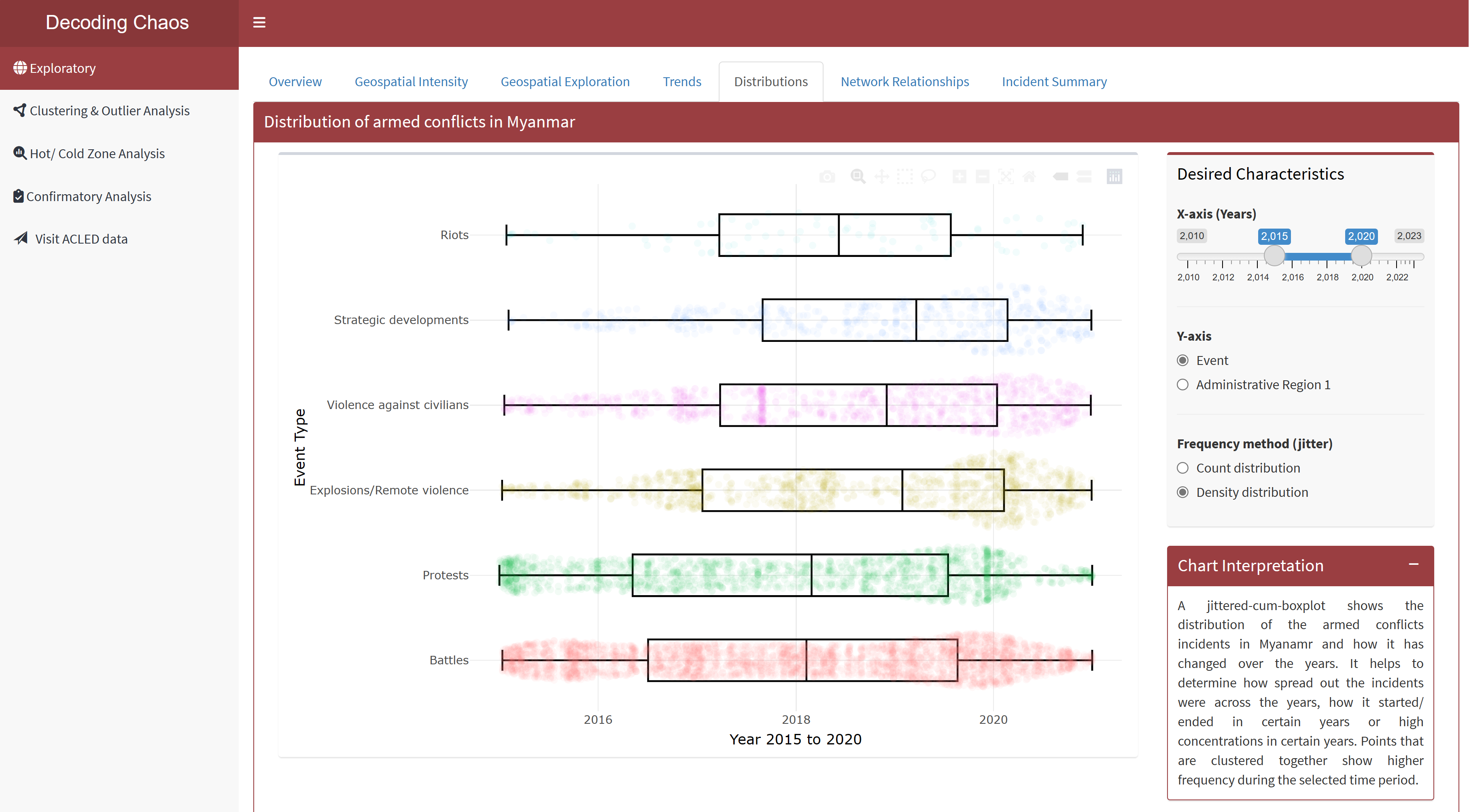
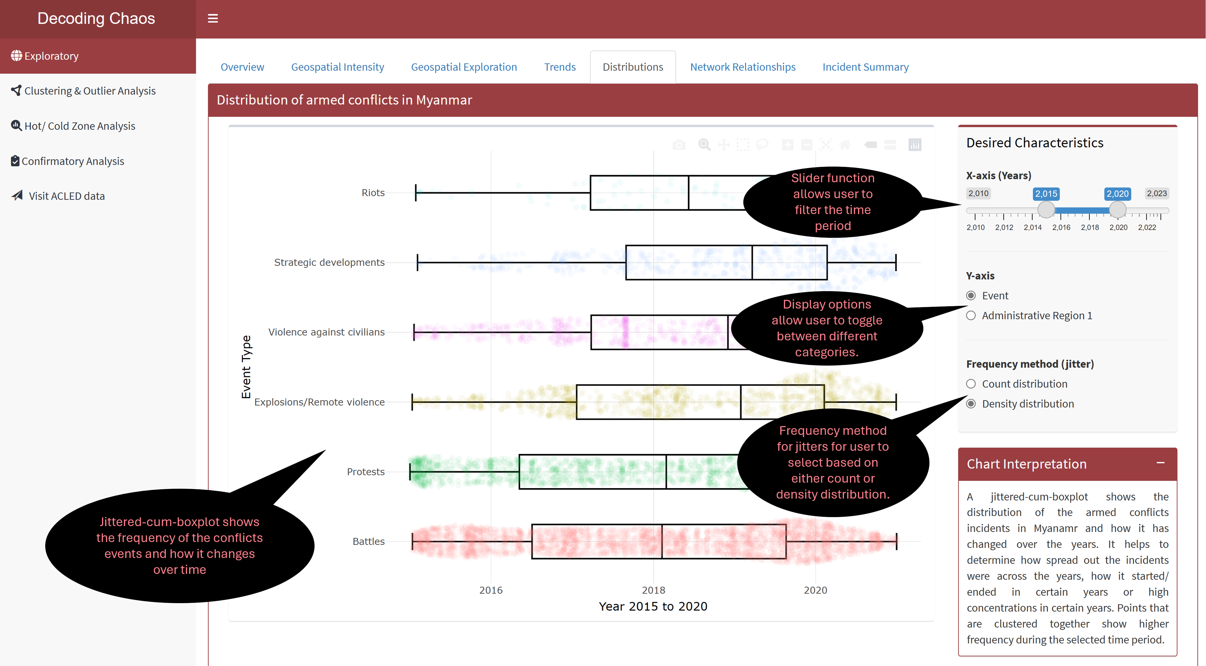
This tab provides user with data exploration tools to explore the distribution of armed conflict incidents using jittered-cum-boxplot that resulted in fatalities and the dispersion of such incidents across the years in Myanmar. Points that are clustered together show higher frequency during the selected time period. Figure below shows the UI interactive features in the Distribution sub-tab.
Code chunk below shows the simplified version of UI and Server components in R Shiny application for Distributions sub-tab.
Show code
# UI Components
ExploreDistributionrow1 <-  fluidRow(
  plotlyOutput(), # display plot 1
  sliderInput(), # select year range
  radioButtons(), # select category (for y-axis)
  radioButtons() # select frequency method for jitter
)

# Server Components
output5 <- renderPlotly({}) # distribution plot 1
Section Six - Network Relationships
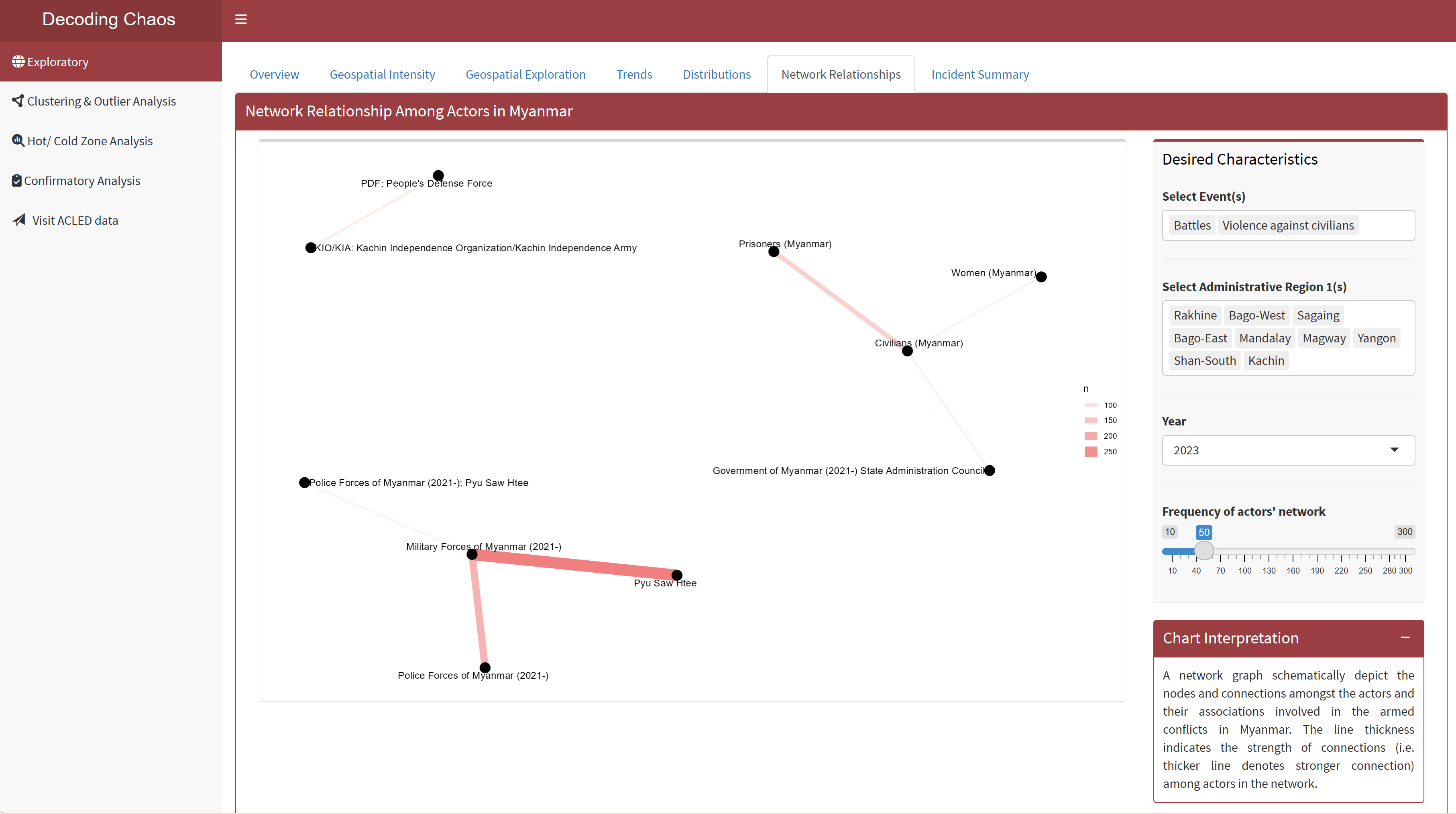
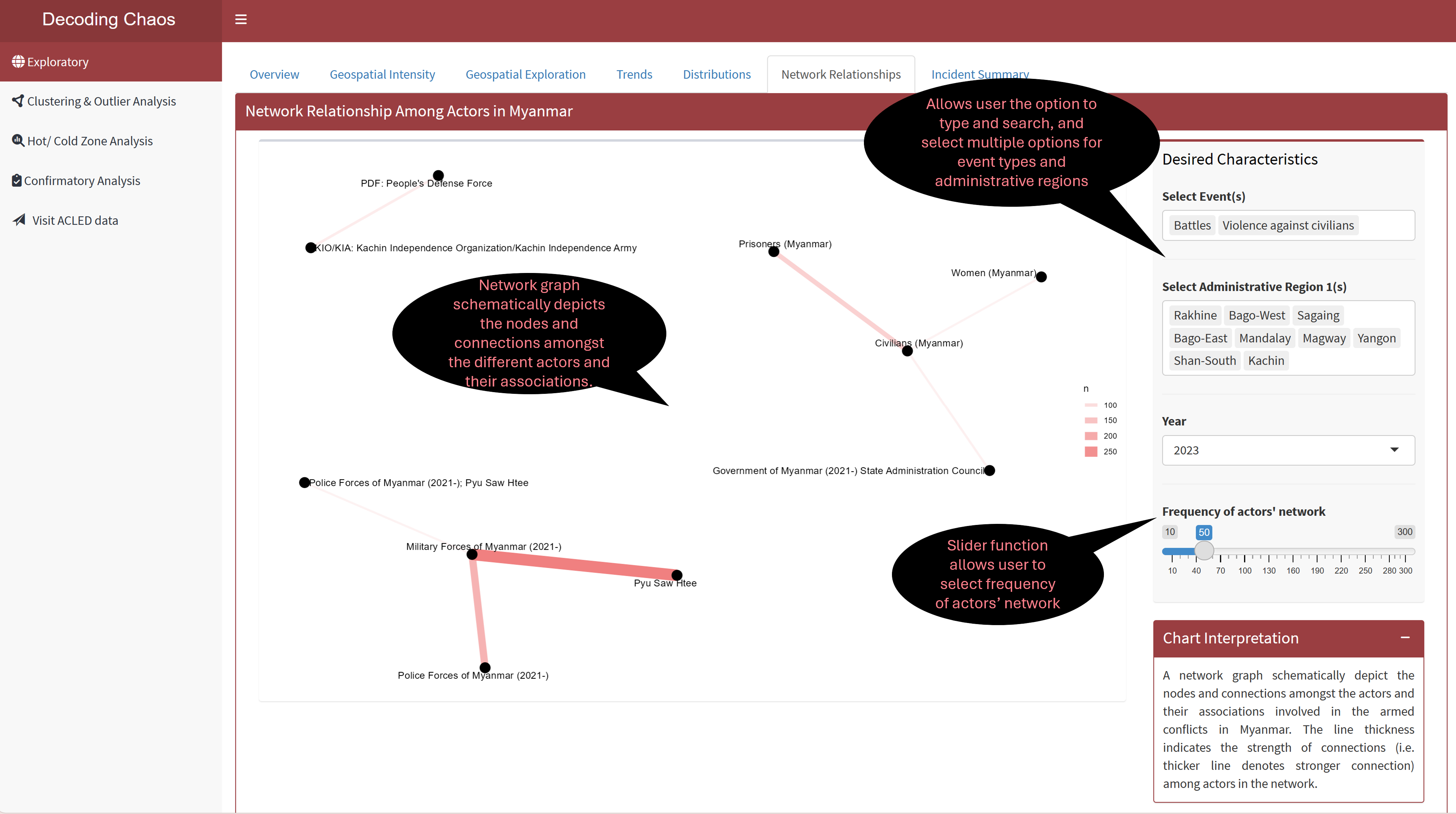
This tab provides users with data exploration tools to explore on the network association amongst the actors (each year) involved in the armed conflict incidents in Myanmar, based on user’s selected preference to determine the frequency of actors’ network association with each other. Figure below shows the UI interactive features in the Network Relationships sub-tab.
Code chunk below shows the simplified version of UI and Server components in R Shiny application for Network Relationships sub-tab.
Show code
# UI Components
ExploreNetworkrow1 <-  fluidRow(
  plotOutput(), # display network graph
  selectizeInput(), # select event (allows multiple selection)
  selectizeInput(), # select administrative region (allows multiple selection)
  selectInput(), # select year
  sliderInput() # select frequency of actors' network
)


# Server Components
output6 <- renderPlot({}) # network graph
Section Seven - Incident Summary
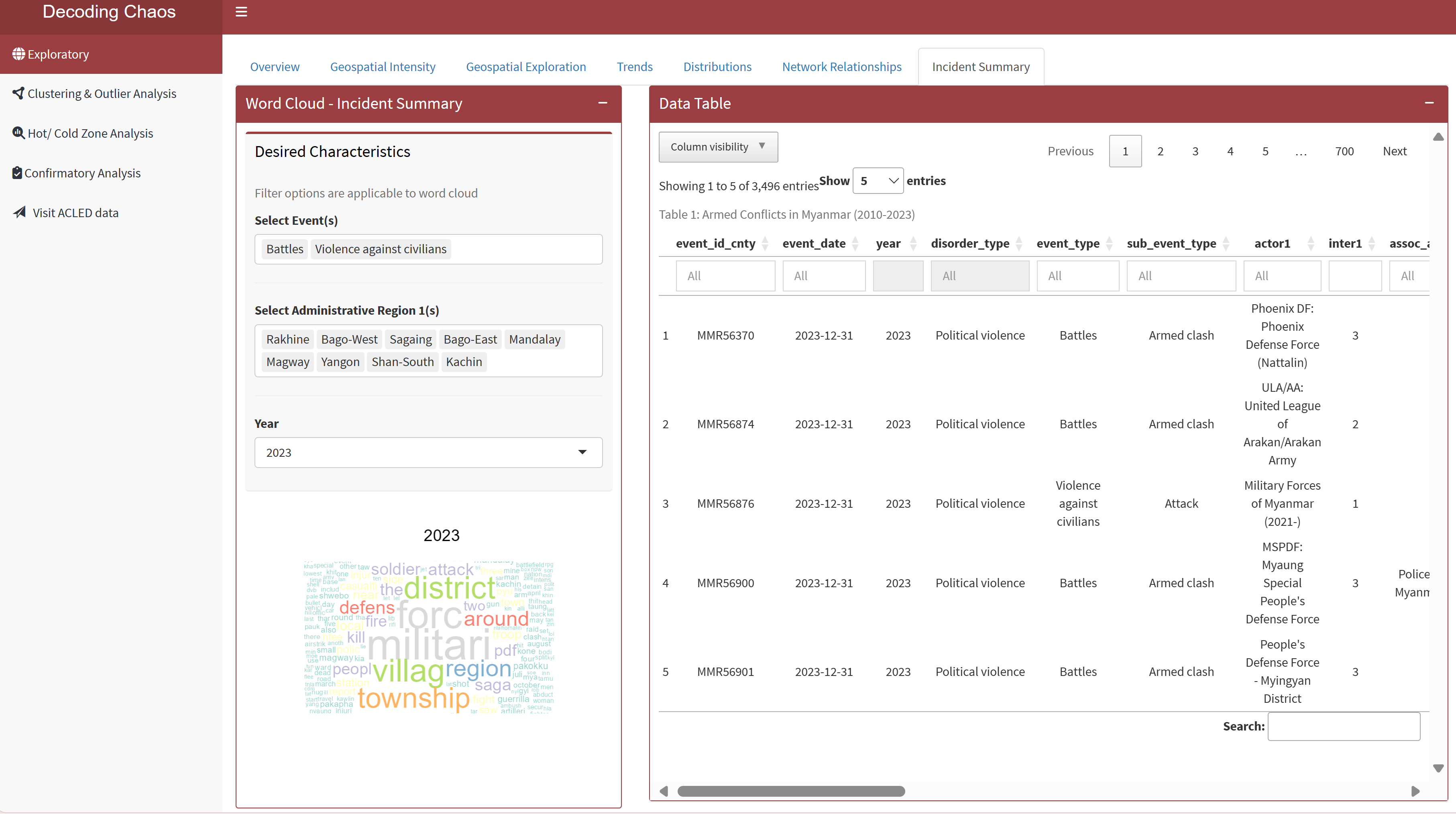
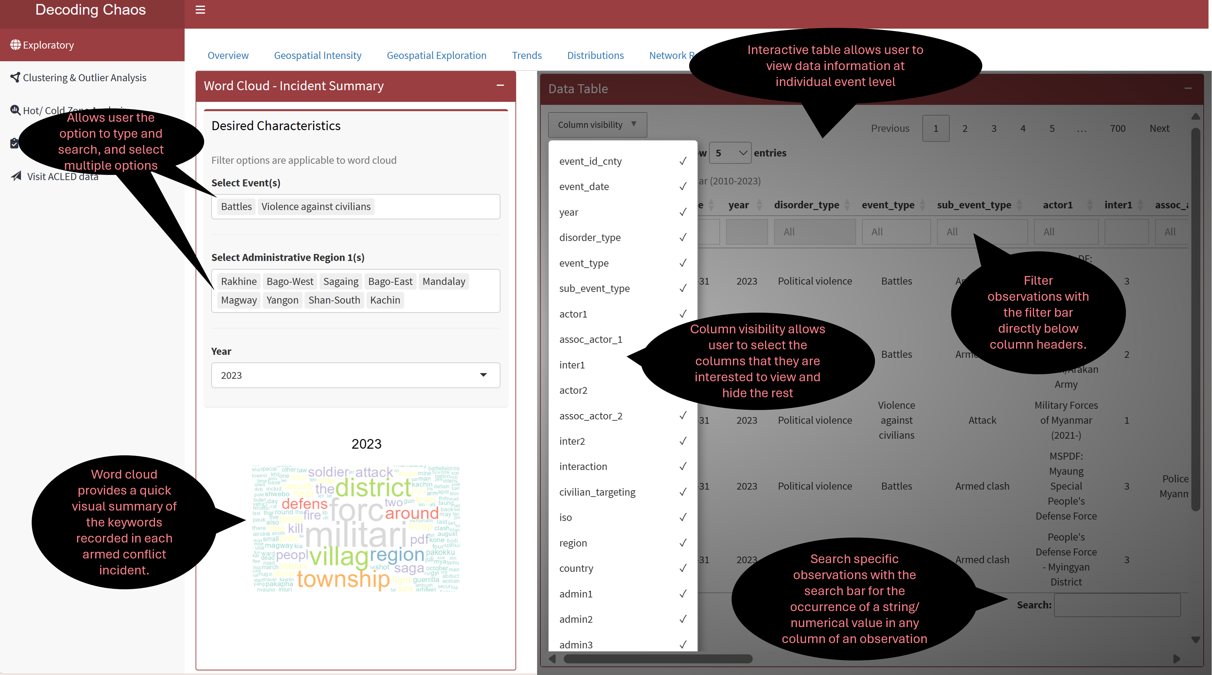
This tab visualises large volume of armed conflict incident summary notes that captures keywords recorded in a word cloud. This is useful to spot changes over time where users do not have to read through all incident summary notes. In addition, an interactive datatable (that is linked to the selection of the word cloud) is provided for users who prefer to explore the dataset.
Figure below shows the UI interactive features in the Incident Summary sub-tab.
Code chunk below shows the simplified version of UI and Server components in R Shiny application for Incident Summary sub-tab.
Show code
# UI Components
ExploreSummaryrow1 <-  fluidRow(
  selectizeInput(), # select event (allows multiple selection)
  selectizeInput(), # select administrative region (allows multiple selection)
  selectInput(), # select year
  plotOutput(), # display word cloud
  DT::dataTableOutput() # display datatable
  )


# Server Components
output7.1 <- renderPlot({}) # word cloud

output7.2 <- DT::renderDataTable({}) # data table
3. R Shiny Application (simplified code)
The storyboard (in Section 2) facilitates the development of a prototype in R Shiny Application. Iterative prototyping will allow continuous improvement of the final dashboard for the project when combined with the other team members’ work.
The proposed layouts and UI features for “Exploratory” have been conceptualised into seven sections (or tabPanel() in R Shiny Application terms), in which ExploreSubTabs will form one of the tabsetPanel() in the entire project dashboard as part of UI.
Click on the R Shiny Application Prototype to explore its interactive features! Please note that this is not the final project dashboard, but a standalone working module which will be still be improvised.
Code chunk below shows the simplified version of R Shiny Application for Exploratory prototype.
#==========================================================
## load R packages
#==========================================================
pacman::p_load(shiny, shinydashboard, shinycssloaders, tidyverse, dplyr,
               leaflet, plotly, highcharter, ggthemes, fresh, sf, spdep, tmap,
               tm, ggforce, ggraph, igraph, wordcloud, tidytext, DT)


#==========================================================
## UI Components
#==========================================================
# main header ---
header <- dashboardHeader(title = "Decoding Chaos")


# main sidebar ---
sidebar <- dashboardSidebar()

sidebarMenu(
    menuItem("Exploratory", tabName = "Exploratory"),
    menuItem("Clustering & Outlier Analysis", tabName = "Clustering"),
    menuItem("Hot/ Cold Zone Analysis", tabName = "HotCold"),
    menuItem("Confirmatory Analysis", tabName = "Confirmatory"),
    menuItem("Visit ACLED data"))

# main body ---
body <- dashboardBody(
    tabItems(
      tabItem(tabName = "Exploratory",
            ExploreSubTabs
            ),
    tabItem(tabName = "Cluster and Outlier Analysis"
            ),
    tabItem(tabName = "Hot/ Cold Zone Analysis"
            ),
    tabItem(tabName = "Confirmatory Analysis"
            )
      )
    )

# fluidRows ---
ExploreOverviewrow1 <-  fluidRow(
  leafletOutput(), # display point spatial map
  selectizeInput(), # select event (allows multiple selection)
  selectizeInput(), # select administrative region (allows multiple selection)
  sliderInput() # select year range
)

ExploreIntensityrow1 <-  fluidRow(
  leafletOutput(), # display point spatial map
  selectizeInput(), # select event (allows multiple selection)
  selectizeInput(), # select administrative region (allows multiple selection)
  sliderInput(), # select year range
  sliderInput(), # select radius intensity
  sliderInput(), # select blur intensity
  sliderInput() # select max point intensity
)

ExploreGeospatialrow1 <-  fluidRow(
  radioButtons(), # display radio button options
  tmapOutput(), # display statistical distribution map
  tmapOutput(), # display spatial distribution map
  selectInput(), # dropdown box selection for year
  radioButtons(), # display radio button options
  selectInput(), # dropbox selection for classification types
  selectInput() # dropbox selection for number of classes
)

ExploreTrendrow1 <-  fluidRow(
  highchartOutput() # display line chart
)

ExploreTrendrow2 <-  fluidRow(
  plotlyOutput(), # display calendar heatmap
  selectInput(), # dropdown box selection for year
  radioButtons() # display radio button options
)

ExploreDistributionrow1 <-  fluidRow(
  plotlyOutput(), # display plot 1
  sliderInput(), # select year range
  radioButtons(), # select category (for y-axis)
  radioButtons() # select frequency method for jitter
)

ExploreNetworkrow1 <-  fluidRow(
  plotOutput(), # display network graph
  selectizeInput(), # select event (allows multiple selection)
  selectizeInput(), # select administrative region (allows multiple selection)
  selectInput(), # select year
  sliderInput() # select frequency of actors' network
)

ExploreSummaryrow1 <-  fluidRow(
  selectizeInput(), # select event (allows multiple selection)
  selectizeInput(), # select administrative region (allows multiple selection)
  selectInput(), # select year
  plotOutput(), # display word cloud
  DT::dataTableOutput() # display datatable
  )

# subtabs
ExploreSubTabs <- tabsetPanel(
  tabPanel("Overview",
           ExploreOverviewrow1
  ),
  tabPanel("Overview",
           ExploreIntensityrow1
  ),
  tabPanel("Geospatial Exploration",
           ExploreGeospatialrow1
  ),
  tabPanel("Trends",
           ExploreTrendrow1,
           ExploreTrendrow2
  ),
  tabPanel("Distribution",
           ExploreDistributionrow1,
           ExploreDistributionrow2,
           ExploreDistributionrow3
  ),
  tabPanel("Network Relationship",
           ExploreNetworkrow1
  ),
  tabPanel("Incident Summary",
           ExploreSummaryrow1
  )
)


#==========================================================
## UI dashboard
#==========================================================
ui <- dashboardPage(title = 'Armed Conflicts in Myanmar (2010 to 2023)',
                    header, sidebar, body)


#==========================================================
## Server Components
#==========================================================
server <- function(input, output) {

  output1 <- renderLeaflet({}) # point spatial map

  output2 <- renderLeaflet({}) # spatial intensity map

  output3.1 <- renderTmap({}) # statistical distribution map
  output3.2 <- renderTmap({}) # spatial distribution map

  output4.1 <- renderPlotly({}) # line chart
  output4.2 <- renderPlotly({}) # calendar heatmap

  output5 <- renderPlotly({}) # distribution plot

  output6 <- renderPlot({}) # network graph

  output7.1 <- renderPlot({}) # word cloud
  output7.2 <- DT::renderDataTable({}) # data table

}


#==========================================================
## Run Shiny Application
#==========================================================
shinyApp(ui = ui, server = server)