pacman::p_load(tidyverse, FunnelPlotR, plotly, knitr)Hands-on Exercise 4 - Part 4
Building Funnel Plot with R
Note: Last modified to include author’s details.
1. Getting Started
This hands-on exercise 4 is split into four segments:
Visualising Distribution
Visual Statistical Analysis
Visualising Uncertainty
Building Funnel Plot with R
1.1 Install and launch R packages
For the purpose of this exercise, the following R packages will be used, they are:
tidyverse, a family of R packages for data science process,
readr for importing csv into R.
FunnelPlotR for creating funnel plot.
ggplot2 for creating funnel plot manually.
knitr for building static html table.
plotly for creating interactive funnel plot.
1.2 Importing the data
COVID-19_DKI_Jakarta will be used
Show code
covid19 <- read_csv("data/COVID-19_DKI_Jakarta.csv") %>%
  mutate_if(is.character, as.factor)
1.3 Overview of the data
Show code
summary(covid19) Sub-district ID City District
Min. :3.101e+09 JAKARTA BARAT :56 TAMBORA : 11
1st Qu.:3.172e+09 JAKARTA PUSAT :44 KEBAYORAN BARU: 10
Median :3.173e+09 JAKARTA SELATAN :65 CIPAYUNG : 8
Mean :3.172e+09 JAKARTA TIMUR :65 JATINEGARA : 8
3rd Qu.:3.174e+09 JAKARTA UTARA :31 KEMAYORAN : 8
Max. :3.175e+09 KAB.ADM.KEP.SERIBU: 6 SETIA BUDI : 8
(Other) :214
Sub-district Positive Recovered Death
ANCOL : 1 Min. : 72 Min. : 69 Min. : 0.00
ANGKE : 1 1st Qu.:1644 1st Qu.:1578 1st Qu.: 24.50
BALE KAMBANG: 1 Median :2420 Median :2329 Median : 39.00
BALI MESTER : 1 Mean :2572 Mean :2477 Mean : 40.99
BAMBU APUS : 1 3rd Qu.:3372 3rd Qu.:3242 3rd Qu.: 55.00
BANGKA : 1 Max. :6231 Max. :5970 Max. :158.00
(Other) :261 2. FunnelPlotR Methods
FunnelPlotR package uses ggplot to generate funnel plots. It requires a numerator (events of interest), denominator (population to be considered) and group. The key arguments selected for customisation are:
limit: plot limits (95 or 99).label_outliers: to label outliers (true or false).Poisson_limits: to add Poisson limits to the plot.OD_adjust: to add overdispersed limits to the plot.xrangeandyrange: to specify the range to display for axes, acts like a zoom function.Other aesthetic components such as graph title, axis labels etc.
Show code
funnel_plot(
  numerator = covid19$Positive,
  denominator = covid19$Death,
  group = covid19$`Sub-district`
)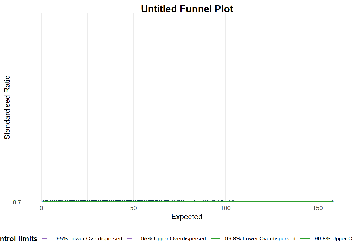
A funnel plot object with 267 points of which 0 are outliers.
Plot is adjusted for overdispersion.
A funnel plot object with 267 points of which 0 are outliers. Plot is adjusted for overdispersion.
Learning Point
groupin this function is different from the scatterplot. Here, it defines the level of the points to be plotted i.e. Sub-district, District or City. If Cityc is chosen, there are only six data points.By default,
data_typeargument is “SR”.limit: Plot limits, accepted values are: 95 or 99, corresponding to 95% or 99.8% quantiles of the distribution.
Show code
funnel_plot(
  numerator = covid19$Death,
  denominator = covid19$Positive,
  group = covid19$`Sub-district`,
  data_type = "PR",     #<<
  xrange = c(0, 6500),  #<<
  yrange = c(0, 0.05)   #<<
)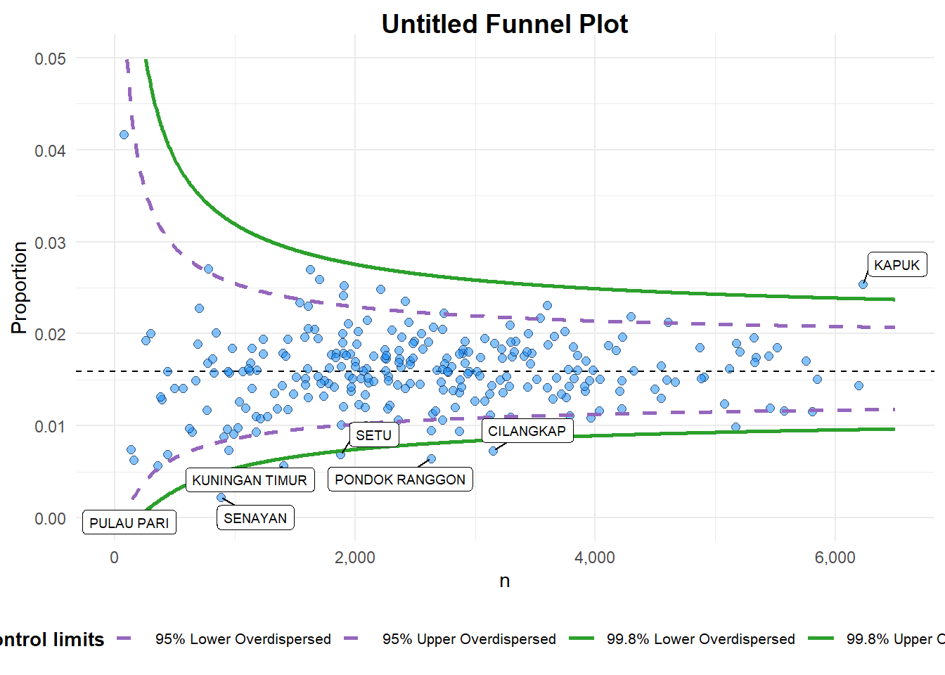
A funnel plot object with 267 points of which 7 are outliers.
Plot is adjusted for overdispersion.
Learning Point
data_typeargument is used to change from default “SR” to “PR” (i.e. proportions).xrangeandyrangeare used to set the range of x-axis and y-axis
Show code
funnel_plot(
  numerator = covid19$Death,
  denominator = covid19$Positive,
  group = covid19$`Sub-district`,
  data_type = "PR",
  xrange = c(0, 6500),
  yrange = c(0, 0.05),
  label = NA,
  title = "Cumulative COVID-19 Fatality Rate by Cumulative Total Number of COVID-19 Positive Cases", #<<
  x_label = "Cumulative COVID-19 Positive Cases", #<<
  y_label = "Cumulative Fatality Rate"  #<<
)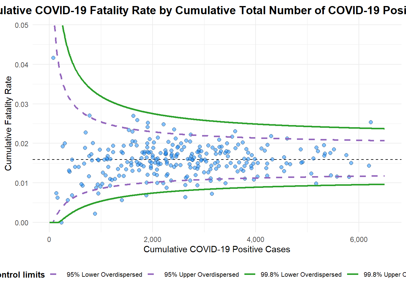
A funnel plot object with 267 points of which 7 are outliers.
Plot is adjusted for overdispersion.
Show code
funnel_plot(
  numerator = covid19$Death,
  denominator = covid19$Positive,
  group = covid19$`Sub-district`,
  data_type = "PR",
  xrange = c(0, 6500),
  yrange = c(0, 0.05),
  label = NA
)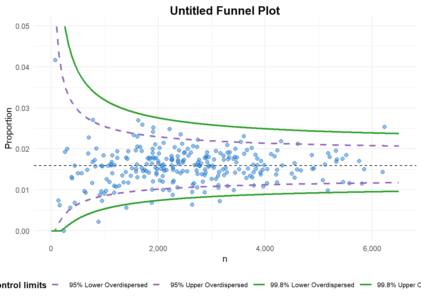
A funnel plot object with 267 points of which 7 are outliers.
Plot is adjusted for overdispersion.
3. Funnel Plot for Fair Visual Comparison: ggplot2 methods
3.1 Basic derived fields
Show code
df <- covid19 %>%
  mutate(rate = Death / Positive) %>%
  mutate(rate.se = sqrt((rate*(1-rate)) / (Positive))) %>%
  filter(rate > 0)
fit.mean is computed by using the code chunk below.
fit.mean <- weighted.mean(df$rate, 1/df$rate.se^2)3.2 Lower/ Upper Limits 95% & 99% CI
Show code
number.seq <- seq(1, max(df$Positive), 1)
number.ll95 <- fit.mean - 1.96 * sqrt((fit.mean*(1-fit.mean)) / (number.seq))
number.ul95 <- fit.mean + 1.96 * sqrt((fit.mean*(1-fit.mean)) / (number.seq))
number.ll999 <- fit.mean - 3.29 * sqrt((fit.mean*(1-fit.mean)) / (number.seq))
number.ul999 <- fit.mean + 3.29 * sqrt((fit.mean*(1-fit.mean)) / (number.seq))
dfCI <- data.frame(number.ll95, number.ul95, number.ll999,
                   number.ul999, number.seq, fit.mean)
3.3 Static funnel plot
Show code
p <- ggplot(df, aes(x = Positive, y = rate)) +
  geom_point(aes(label=`Sub-district`),
             alpha=0.4) +
  geom_line(data = dfCI,
            aes(x = number.seq,
                y = number.ll95),
            size = 0.4,
            colour = "grey40",
            linetype = "dashed") +
  geom_line(data = dfCI,
            aes(x = number.seq,
                y = number.ul95),
            size = 0.4,
            colour = "grey40",
            linetype = "dashed") +
  geom_line(data = dfCI,
            aes(x = number.seq,
                y = number.ll999),
            size = 0.4,
            colour = "grey40") +
  geom_line(data = dfCI,
            aes(x = number.seq,
                y = number.ul999),
            size = 0.4,
            colour = "grey40") +
  geom_hline(data = dfCI,
             aes(yintercept = fit.mean),
             size = 0.4,
             colour = "grey40") +
  coord_cartesian(ylim=c(0,0.05)) +
  annotate("text", x = 1, y = -0.13, label = "95%", size = 3, colour = "grey40") +
  annotate("text", x = 4.5, y = -0.18, label = "99%", size = 3, colour = "grey40") +
  ggtitle("Cumulative Fatality Rate by Cumulative Number of COVID-19 Cases") +
  xlab("Cumulative Number of COVID-19 Cases") +
  ylab("Cumulative Fatality Rate") +
  theme_light() +
  theme(plot.title = element_text(size=12),
        legend.position = c(0.91,0.85),
        legend.title = element_text(size=7),
        legend.text = element_text(size=7),
        legend.background = element_rect(colour = "grey60", linetype = "dotted"),
        legend.key.height = unit(0.3, "cm"))
p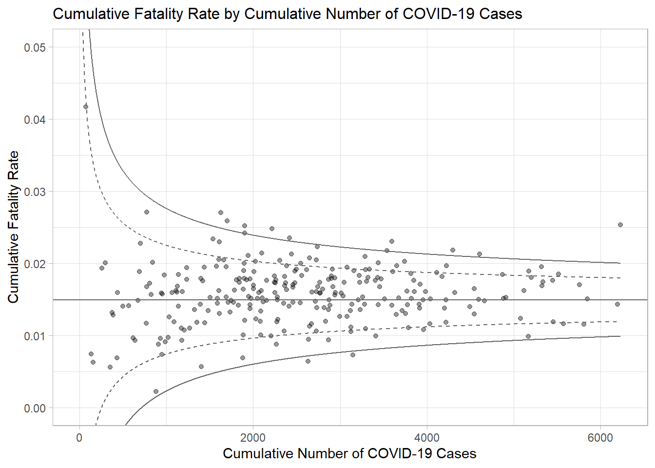
3.4 Interactive Funnel Plot: plotly + ggplot2
Funnel plot created using ggplot2 functions can be made interactive with ggplotly() of plotly r package.
Show code
fp_ggplotly <- ggplotly(p,
  tooltip = c("label",
              "x",
              "y"))
fp_ggplotly