pacman::p_load(GGally, parallelPlot, tidyverse, RColorBrewer)Hands-on Exercise 5 - Part 4
Visual Multivariate Analysis with Parallel Coordinates Plot
Note: Last modified to include author’s details.
1. Getting Started
This exercise will over on the following:
plotting statistic parallel coordinates plots by using
ggparcoord()of GGally package,plotting interactive parallel coordinates plots by using parcoords package, and
plotting interactive parallel coordinates plots by using parallelPlot package.
1.1 Install and launch R packages
For the purpose of this exercise, the following R packages will be used.
1.2 Import the data
This exercise used the World Happiness 2018 report dataset.
Show code
wh <- read_csv("data/WHData-2018.csv")1.3 Overview of the data
Show code
summary(wh) Country Region Happiness score Whisker-high
Length:156 Length:156 Min. :2.905 Min. :3.074
Class :character Class :character 1st Qu.:4.454 1st Qu.:4.590
Mode :character Mode :character Median :5.378 Median :5.478
Mean :5.376 Mean :5.479
3rd Qu.:6.168 3rd Qu.:6.260
Max. :7.632 Max. :7.695
Whisker-low Dystopia GDP per capita Social support
Min. :2.735 Min. :0.292 Min. :0.0000 Min. :0.000
1st Qu.:4.345 1st Qu.:1.654 1st Qu.:0.6162 1st Qu.:1.077
Median :5.285 Median :1.909 Median :0.9495 Median :1.262
Mean :5.273 Mean :1.923 Mean :0.8874 Mean :1.217
3rd Qu.:6.051 3rd Qu.:2.270 3rd Qu.:1.1978 3rd Qu.:1.463
Max. :7.569 Max. :2.961 Max. :1.6490 Max. :1.644
Healthy life expectancy Freedom to make life choices Generosity
Min. :0.0000 Min. :0.0000 Min. :0.0000
1st Qu.:0.4223 1st Qu.:0.3583 1st Qu.:0.1095
Median :0.6440 Median :0.4940 Median :0.1740
Mean :0.5980 Mean :0.4570 Mean :0.1816
3rd Qu.:0.7772 3rd Qu.:0.5800 3rd Qu.:0.2422
Max. :1.0300 Max. :0.7240 Max. :0.5980
Perceptions of corruption
Min. :0.0000
1st Qu.:0.0510
Median :0.0820
Mean :0.1125
3rd Qu.:0.1390
Max. :0.4570 2. Plotting Static Parallel Coordinates Plot
Use ggparcoord(). to plot a basic static parallel coordinates plot.
Show code
ggparcoord(data = wh,
           columns = c(7:12))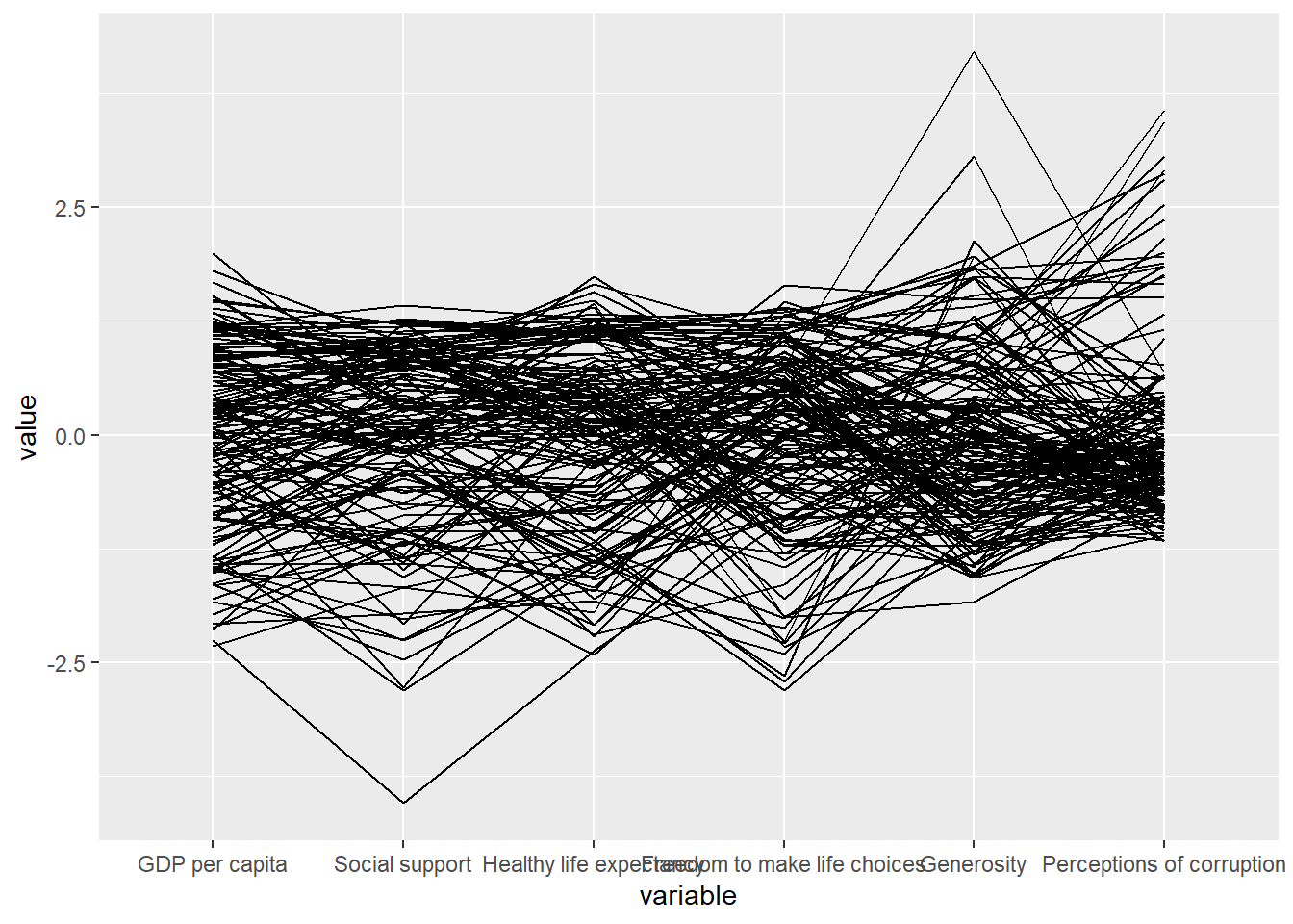
Only two argument namely data and columns is used. Data argument is used to map the data object (i.e. wh) and columns is used to select the columns for preparing the parallel coordinates plot
Set splineFactor = TRUE to smooth lines.
Show code
ggparcoord(data = wh,
           columns = c(7:12),
           splineFactor = TRUE) +
           scale_color_brewer(palette = "Set2")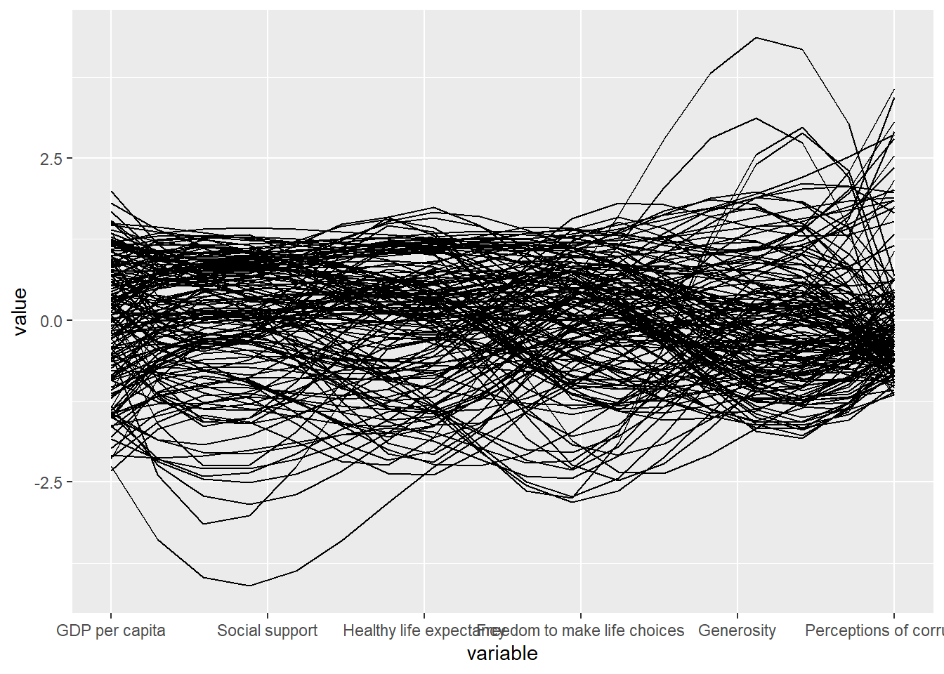
Use ggparcoord() to makeover the existing version.
Show code
ggparcoord(data = wh,
           columns = c(7:12),
           groupColumn = 2,
           scale = "uniminmax",
           alphaLines = 0.2,
           boxplot = TRUE,
           title = "Parallel Coordinates Plot of World Happines Variables")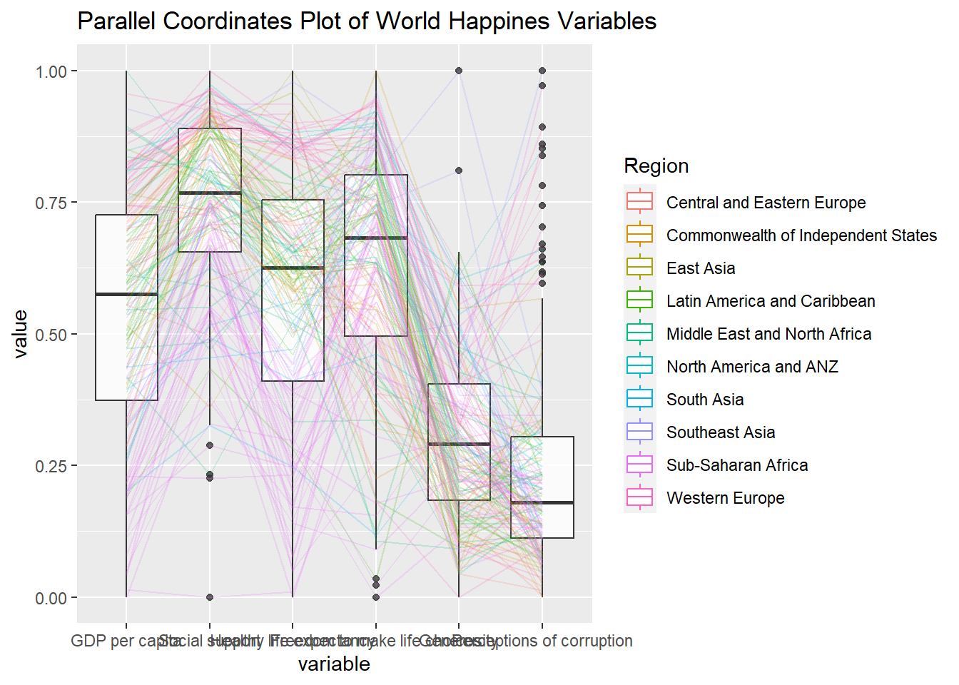
Use facet_wrap() in ggplot2 plot 10 small multiple parallel coordinates plots. Each plot represent one geographical region such as East Asia.
Show code
ggparcoord(data = wh,
           columns = c(7:12),
           groupColumn = 2,
           scale = "uniminmax",
           alphaLines = 0.2,
           boxplot = TRUE,
           title = "Multiple Parallel Coordinates Plots of World Happines Variables by Region") +
  facet_wrap(~ Region)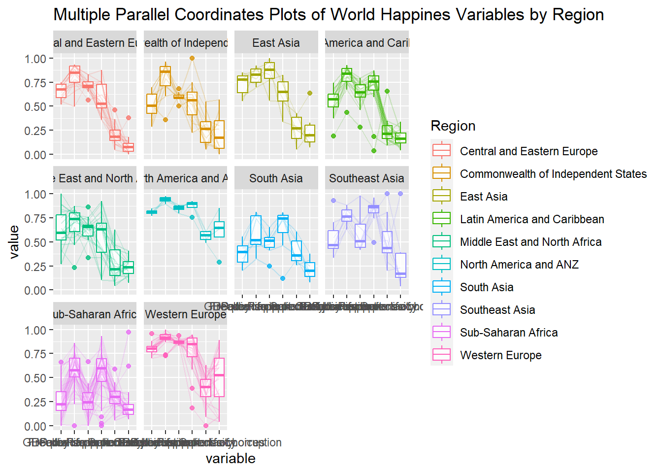
Rotating x-axis text label
Use theme() function in ggplot2 to rotate the axis by 30 degrees.
Show code
ggparcoord(data = wh,
           columns = c(7:12),
           groupColumn = 2,
           scale = "uniminmax",
           alphaLines = 0.2,
           boxplot = TRUE,
           title = "Multiple Parallel Coordinates Plots of World Happines Variables by Region") +
  facet_wrap(~ Region) +
  theme(axis.text.x = element_text(angle = 30))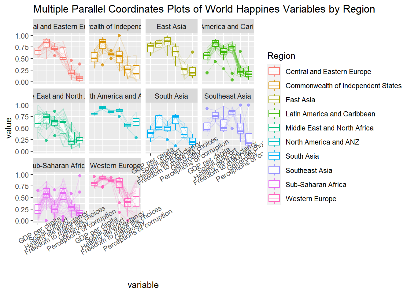
Adjusting the rotated x-axis text label
Use hjust argument to theme’s text element with element_text() to rotating x-axis text labels to 30 degrees makes the label overlap with the plot and avoid this by adjusting the text location with axis.text.x.
Show code
ggparcoord(data = wh,
           columns = c(7:12),
           groupColumn = 2,
           scale = "uniminmax",
           alphaLines = 0.2,
           boxplot = TRUE,
           title = "Multiple Parallel Coordinates Plots of World Happines Variables by Region") +
  facet_wrap(~ Region) +
  theme(axis.text.x = element_text(angle = 30, hjust=1))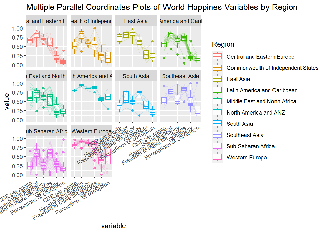
3. Plotting Interactive Parallel Coordinates Plot
parallelPlot is an R package specially designed to plot a parallel coordinates plot by using ‘htmlwidgets’ package and d3.js.
Use parallelPlot() to plot interactive parallel coordinates plot.
Show code
wh <- wh %>%
  select("Happiness score", c(7:12))
parallelPlot(wh,
             width = 320,
             height = 250)
Use rotateTitle argument to avoid overlapping axis labels.
Show code
parallelPlot(wh,
             rotateTitle = TRUE)
Do you know?
An interactive feature of parallelPlot allows user to click on a variable of interest, for example Happiness score, the monotonous blue colour (default) will change a blues with different intensity colour scheme will be used.
Use continuousCS argument to change default colour (blue) to other colours.
Show code
parallelPlot(wh,
             continuousCS = "YlOrRd",
             rotateTitle = TRUE)
Use histoVisibility argument to plot histogram along the axis of each variables.
Show code
histoVisibility <- rep(TRUE, ncol(wh))
parallelPlot(wh,
             rotateTitle = TRUE,
             continuousCS = "BuPu",
             histoVisibility = histoVisibility)
4. Parallel Coordinates (Ordering Methods)
This is a self-exploratory segment on parallel coordinates based on different ordering methods. Given that groupColumn has to be in categorical format, Happiness Score variable is first binned into 5 groups.
Show code
binning <- wh %>%
  mutate(
    # binning happiness score into 5 groups
    happinessGroup = (quantile_Rank=ntile(wh$`Happiness score`,5)),

    # renaming bin happiness labels
    happinessGroup = factor(happinessGroup, labels = c("Lowest", "Low", "Average", "High", "Highest"))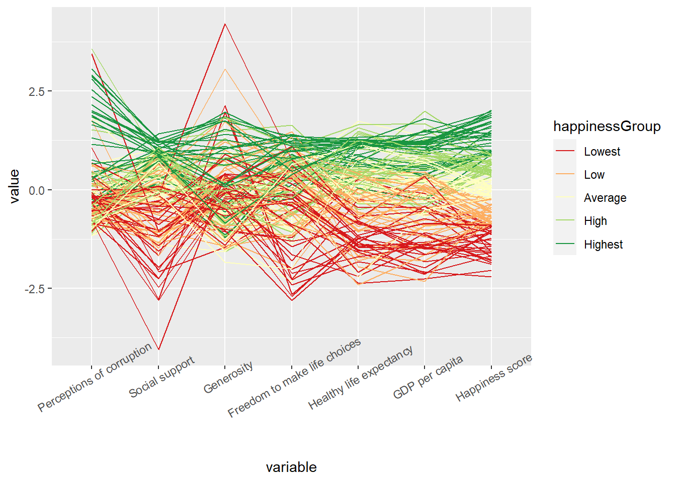
)Set order =“anyClass” with ggparcoord() for order by maximum of k F-statistics.
Show code
ggparcoord(data = binning,
          columns = c(1:7),
          groupColumn = "happinessGroup",
          order = "anyClass") +
          scale_color_brewer(palette = "RdYlGn") +
          theme(axis.text.x = element_text(angle = 30))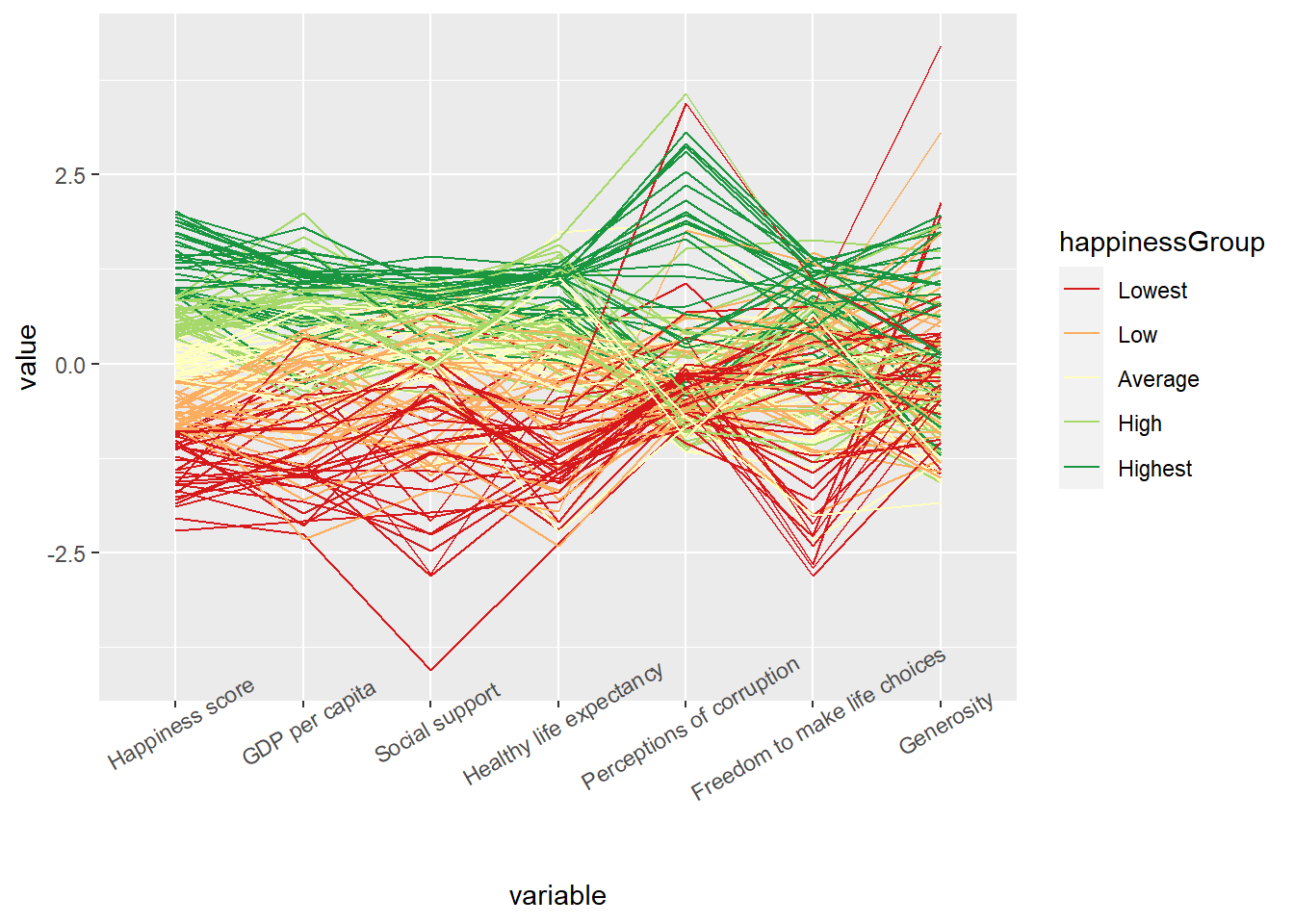
Set order =“allClass” with ggparcoord() for order by F-statistics from an ANOVA.
Show code
ggparcoord(data = binning,
          columns = c(1:7),
          groupColumn = "happinessGroup",
          order = "allClass") +
          scale_color_brewer(palette = "RdYlGn") +
          theme(axis.text.x = element_text(angle = 30))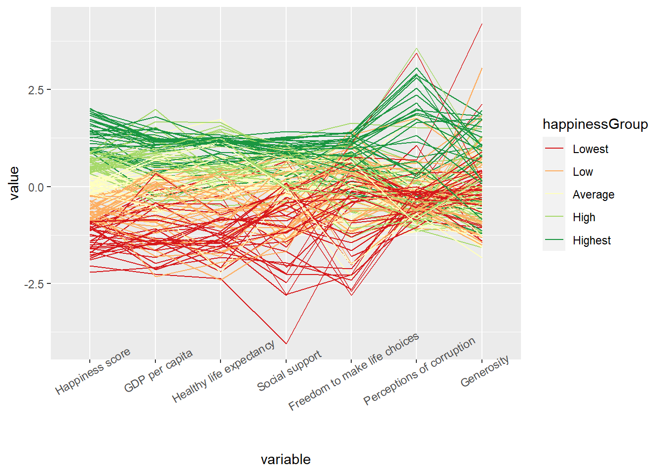
Set order =“skewness” with ggparcoord() for order by sample skewness.
Show code
ggparcoord(data = binning,
          columns = c(1:7),
          groupColumn = "happinessGroup",
          order = "skewness") +
          scale_color_brewer(palette = "RdYlGn") +
          theme(axis.text.x = element_text(angle = 30))