pacman::p_load(seriation, dendextend, heatmaply, tidyverse, readxl)Hands-on Exercise 5 - Part 3
Visual Multivariate Analysis with Heatmap
Note: Last modified to include author’s details.
1. Getting Started
1.1 Install and launch R packages
For the purpose of this exercise, the following R packages will be used, they are:
tidyverse, a family of R packages for data science process,
seriation for arranging objects in a linear order set,
dendextend provides a set of functions for visualising dendrogram objects and compare trees of hierarchical clusterings,
heatmaply for creating interactive heatmaps, and
readxl for reading excel spreadsheets.
1.2 Import the data
This exercise used the World Happiness 2018 report dataset.
Show code
wh <- read_csv("data/WHData-2018.csv")1.3 Preparation of the data
Rows were replaced with country name instead of row number by using the code chunk below.
Show code
row.names(wh) <- wh$Country1.4 Transform data frame into matrix
Note
Data is usually loaded into a data frame. To make heatmap, data matrix is required.
Use data.matrix() to tranform data frame into data matrix.
wh1 <- dplyr::select(wh, c(3, 7:12))
wh_matrix <- data.matrix(wh)
1.5 Overview of the data
Show code
summary(wh) Country Region Happiness score Whisker-high
Length:156 Length:156 Min. :2.905 Min. :3.074
Class :character Class :character 1st Qu.:4.454 1st Qu.:4.590
Mode :character Mode :character Median :5.378 Median :5.478
Mean :5.376 Mean :5.479
3rd Qu.:6.168 3rd Qu.:6.260
Max. :7.632 Max. :7.695
Whisker-low Dystopia GDP per capita Social support
Min. :2.735 Min. :0.292 Min. :0.0000 Min. :0.000
1st Qu.:4.345 1st Qu.:1.654 1st Qu.:0.6162 1st Qu.:1.077
Median :5.285 Median :1.909 Median :0.9495 Median :1.262
Mean :5.273 Mean :1.923 Mean :0.8874 Mean :1.217
3rd Qu.:6.051 3rd Qu.:2.270 3rd Qu.:1.1978 3rd Qu.:1.463
Max. :7.569 Max. :2.961 Max. :1.6490 Max. :1.644
Healthy life expectancy Freedom to make life choices Generosity
Min. :0.0000 Min. :0.0000 Min. :0.0000
1st Qu.:0.4223 1st Qu.:0.3583 1st Qu.:0.1095
Median :0.6440 Median :0.4940 Median :0.1740
Mean :0.5980 Mean :0.4570 Mean :0.1816
3rd Qu.:0.7772 3rd Qu.:0.5800 3rd Qu.:0.2422
Max. :1.0300 Max. :0.7240 Max. :0.5980
Perceptions of corruption
Min. :0.0000
1st Qu.:0.0510
Median :0.0820
Mean :0.1125
3rd Qu.:0.1390
Max. :0.4570 2. Plotting Static Heatmap
R packages and functions that can be used to create static heatmaps:
heatmap() draws a simple heatmap.
heatmap.2() draws an enhanced heatmap compared to the R base function.
pheatmap() (aka. Pretty Heatmap) provides functions to draws pretty heatmaps and provides more control to change the appearance of heatmaps.
ComplexHeatmap draws, annotates and arranges complex heatmaps (very useful for genomic data analysis).
superheat is a Graphical Tool for Exploring Complex Datasets Using Heatmaps. A system for generating extendable and customizable heatmaps for exploring complex datasets, including big data and data with multiple data types.
2.1 heatmap() of R Stats
Use heatmap() of Base Stats to plot static heatmap.
Show code
wh_heatmap <- heatmap(wh_matrix,
                      Rowv=NA, Colv=NA)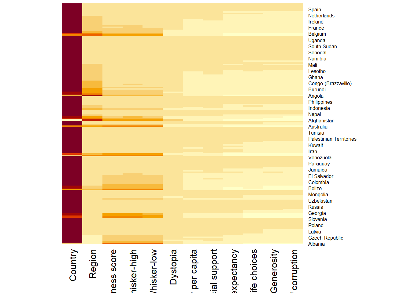
Note
By default,
heatmap()plots a cluster heatmap.The arguments
Rowv=NAandColv=NAare used to switch off the option of plotting the row and column dendrograms.The arguments
cexRowandcexColare used to define the font size used for y-axis and x-axis labels respectively.The argument
marginsis used to ensure that the entire x-axis labels are displayed completely.The argument
scalecan be used to normalise matrix (e.g. column-wise).
Show code
wh_heatmap <- heatmap(wh_matrix,
                      #define font size for y-axis and x-axis labels
                      cexRow = 0.6,
                      cexCol = 0.8,
                      #margins ensure entire x-axis labels are displayed completely
                      margins = c(10, 4)
)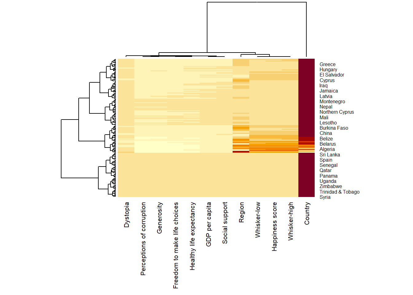
3. Creating Interactive Heatmap
heatmaply is used to build interactive cluster heatmap that can be shared online as a stand-alone HTML file.
heatmaply(wh_matrix[, -c(1, 2, 4, 5)])
Note
Learning Points
heatmaply() plots horizontal (default) dendrogram on left hand side of the heatmap and text label of each row on the right hand side.
When the x-axis marker labels are too long, they will be rotated by 135 degree from the north.
3.1 Data Transformation
To ensure that all variables have comparable values, given that variables in the data set includes different types of measurement; data transformation is used before clustering.
Three main data transformation methods are supported by heatmaply(), namely: scale, normalise and percentilse.
For variables with normal distribution:
Scaling (i.e. subtract the mean and divide by the standard deviation) would bring them all close to the standard normal distribution.
Each value would reflect the distance from the mean in units of standard deviation.
The scale argument in heatmaply() supports column and row scaling.
Show code
heatmaply(wh_matrix[, -c(1, 2, 4, 5)],
          scale = "column")
For variables with possibly different (and non-normal) distribution:
Normalize function can be used to bring data to the 0 to 1 scale by subtracting the minimum and dividing by the maximum of all observations.
This preserves the shape of each variable’s distribution while making them easily comparable on the same “scale”.
Note: Normalise method is performed on input data set (ie. wh_matrix), which is different from Scaling method.
Show code
heatmaply(normalize(wh_matrix[, -c(1, 2, 4, 5)]))Similar to ranking the variables, but instead of keeping the rank values, divide them by the maximal rank.
This is done by using the ecdf of the variables on their own values, bringing each value to its empirical percentile.
The benefit of the
percentizefunction is that each value has a relatively clear interpretation, it is the percent of observations that got that value or below it.
Note: Percentize method is performed on input data set (ie. wh_matrix), which is similar to from Normalize method.
Show code
heatmaply(percentize(wh_matrix[, -c(1, 2, 4, 5)]))3.2 Clustering alogrithm
heatmaply supports a variety of hierarchical clustering algorithm. The main arguments provided are:
distfun: function used to compute the distance (dissimilarity) between both rows and columns. Defaults to dist. The options “pearson”, “spearman” and “kendall” can be used to use correlation-based clustering, which uses as.dist(1 - cor(t(x))) as the distance metric (using the specified correlation method).
hclustfun: function used to compute the hierarchical clustering when Rowv or Colv are not dendrograms. Defaults to hclust.
dist_method default is NULL, which results in “euclidean” to be used. It can accept alternative character strings indicating the method to be passed to distfun. By default distfun is “dist”” hence this can be one of “euclidean”, “maximum”, “manhattan”, “canberra”, “binary” or “minkowski”.
hclust_method default is NULL, which results in “complete” method to be used. It can accept alternative character strings indicating the method to be passed to hclustfun. By default hclustfun is hclust hence this can be one of “ward.D”, “ward.D2”, “single”, “complete”, “average” (= UPGMA), “mcquitty” (= WPGMA), “median” (= WPGMC) or “centroid” (= UPGMC).
Manual approach vs Statistical approach
In the code chunk below, the heatmap is plotted by using hierachical clustering algorithm with “Euclidean distance” and “ward.D” method.
Show code
heatmaply(normalize(wh_matrix[, -c(1, 2, 4, 5)]),
          dist_method = "euclidean",
          hclust_method = "ward.D")
Use dend_expend() and find_k() functions of dendextend package to determine the best clustering method and number of cluster.
- Use dend_expend() will be used to determine the recommended clustering method to be used.
Show code
wh_d <- dist(normalize(wh_matrix[, -c(1, 2, 4, 5)]), method = "euclidean")
dend_expend(wh_d)[[3]]
dist_methods hclust_methods optim
1 unknown ward.D 0.6137851
2 unknown ward.D2 0.6289186
3 unknown single 0.4774362
4 unknown complete 0.6434009
5 unknown average 0.6701688
6 unknown mcquitty 0.5020102
7 unknown median 0.5901833
8 unknown centroid 0.6338734The output table shows that “average” method should be used because it gave the high optimum value.
- Use find_k() is used to determine the optimal number of cluster.
wh_clust <- hclust(wh_d, method = "average")
num_k <- find_k(wh_clust)
plot(num_k)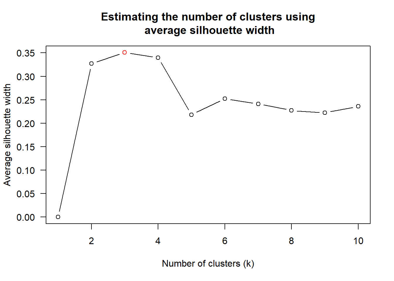
Figure above shows that k=3 would be good.
- Prepare statistical analysis results.
Show code
heatmaply(normalize(wh_matrix[, -c(1, 2, 4, 5)]),
          dist_method = "euclidean",
          hclust_method = "average",
          k_row = 3)
3.3 Seriation
Problem with hierarchical clustering
- Does not place rows in a definite order, it merely constrains the space of possible ordering.
heatmaply uses the seriation package to find an optimal ordering of rows and columns. Optimal means to optimise the Hamiltonian path length that is restricted by the dendrogram structure. It rotates the branches so that the sum of distances between each adjacent leaf (label) will be minimised.
Seriation algorithm: Optimal Leaf Ordering (OLO). This algorithm starts with the output of an agglomerative clustering algorithm and produces a unique ordering, one that flips the various branches of the dendrogram around so as to minimise the sum of dissimilarities between adjacent leaves.
“OLO” (Optimal leaf ordering)- default - optimises the above criterion (in O(n^4)).“GW” (Gruvaeus and Wainer)aims for the same goal but uses a potentially faster heuristic.“mean”gives the output (default from heatmap functions) in other packages such as gplots::heatmap.2.“none”gives us the dendrograms without any rotation that is based on the data matrix.
Show code
heatmaply(normalize(wh_matrix[, -c(1, 2, 4, 5)]),
          seriate = "OLO")
Show code
heatmaply(normalize(wh_matrix[, -c(1, 2, 4, 5)]),
          seriate = "GW")
Show code
heatmaply(normalize(wh_matrix[, -c(1, 2, 4, 5)]),
          seriate = "mean")
Show code
heatmaply(normalize(wh_matrix[, -c(1, 2, 4, 5)]),
          seriate = "none")
3.4 Colour Palettes
There are 3 types of palettes:
Sequential palettes: Suitable for ordered data that progress from low to high.
Note: Default colour palette uses by heatmaply is viridis. Click here to find out more on the different colour palettes.
Diverging palettes: Place equal emphasis on mid-range critical values and extremes at both ends of the data range.
Qualitative palettes: Most suitable to representing nominal or categorical data, with no implied magnitude differences between legend classes, and hues are used to create the primary visual differences between classes.
Show code
heatmaply(normalize(wh_matrix[, -c(1, 2, 4, 5)]),
          Colv=NA,
          seriate = "none",
          k_row = 5,
          margins = c(NA,200,60,NA),
          fontsize_row = 4,
          fontsize_col = 5,
          main="World Happiness Score and Variables by Country, 2018 \nDataTransformation using Normalise Method",
          xlab = "World Happiness Indicators",
          ylab = "World Countries"
          )
Show code
heatmaply(normalize(wh_matrix[, -c(1, 2, 4, 5)]),
          Colv=NA,
          seriate = "none",
          colors = Blues,
          k_row = 5,
          margins = c(NA,200,60,NA),
          fontsize_row = 4,
          fontsize_col = 5,
          main="World Happiness Score and Variables by Country, 2018 \nDataTransformation using Normalise Method",
          xlab = "World Happiness Indicators",
          ylab = "World Countries"
          )
Show code
heatmaply(normalize(wh_matrix[, -c(1, 2, 4, 5)]),
          Colv=NA,
          seriate = "none",
          colors = RdPu,
          k_row = 5,
          margins = c(NA,200,60,NA),
          fontsize_row = 4,
          fontsize_col = 5,
          main="World Happiness Score and Variables by Country, 2018 \nDataTransformation using Normalise Method",
          xlab = "World Happiness Indicators",
          ylab = "World Countries"
          )
In summary, the code chunk above used the following arguments:
colors is used to change the colour palette to ‘Blue’ and ‘Red to Purple’
k_row is used to produce ‘5 groups’.
margins is used to change the top margin to ‘60’ and row margin to ‘200’.
fontsizw_row and fontsize_col are used to change the font size for row and column labels to ‘4’.
main is used to write the main title of the plot.
xlab and ylab are used to write the x-axis and y-axis labels respectively.