Show code
pacman::p_load(ggHoriPlot, ggthemes, tidyverse, RColorBrewer)Time on the Horizon: ggHoriPlot methods
The code chunk used is as follows:
pacman::p_load(ggHoriPlot, ggthemes, tidyverse, RColorBrewer)This in-class exercise uses dataset - Average Retail Prices Of Selected Consumer Items.
Use the code chunk below to import the AVERP.csv file into R environment.
averp <- read_csv("data/AVERP.csv") %>%
mutate(`Date` = dmy(`Date`)) # mutate date (from initial character format)Code chunk below plots classic line graph. This type of graph has its limitations in visualising large time-series data.
averp %>%
  filter(Date >= "2018-01-01") %>%
  ggplot() +
  geom_line(aes(x=Date,
                y=Values, color=`Consumer Items`)) +
  labs(x="Year", y="Consumer Items Retail Prices",
       title = 'Average Retail Prices of Selected Consumer Items (Jan 2018 to Dec 2022)') +
  theme_minimal() +
  theme(panel.spacing.y=unit(0, "lines"), strip.text.y = element_text(
    size = 5, angle = 0, hjust = 0),
    legend.position = 'none',
    panel.grid = element_blank(),
    axis.text.x = element_text(size = 8),
    axis.text.y = element_text(size = 8),
    axis.ticks.y = element_blank(),
    panel.border = element_blank()
    ) +
  scale_x_date(expand=c(0,0), date_breaks = "3 month", date_labels = "%b%y")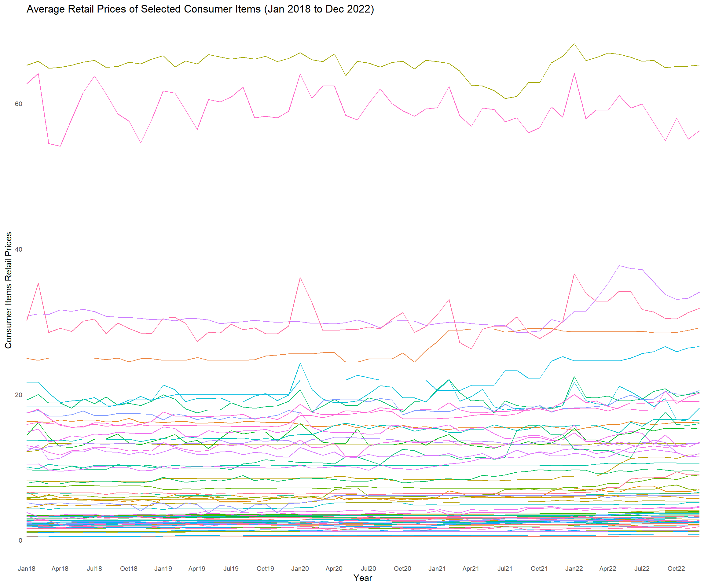
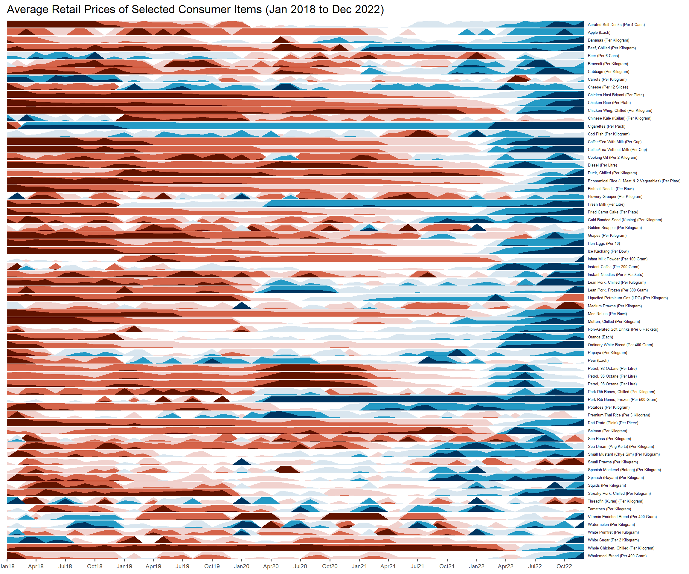
An alternative method will be to plot a horizon graph.
Code chunk below plots horizon graph. This type of graph is suitable for massive time-series data.
averp %>%
  filter(Date >= "2018-01-01") %>%
  ggplot() +
  geom_horizon(aes(x = Date, y=Values),
               origin = "midpoint",
               horizonscale = 6)+
  facet_grid(`Consumer Items`~.) +
    theme_few() +
  scale_fill_hcl(palette = 'RdBu') +
  theme(panel.spacing.y=unit(0, "lines"), strip.text.y = element_text(
    size = 5, angle = 0, hjust = 0),
    legend.position = 'none',
    axis.text.y = element_blank(),
    axis.text.x = element_text(size=7),
    axis.title.y = element_blank(),
    axis.title.x = element_blank(),
    axis.ticks.y = element_blank(),
    panel.border = element_blank()
    ) +
    scale_x_date(expand=c(0,0), date_breaks = "3 month", date_labels = "%b%y") +
  ggtitle('Average Retail Prices of Selected Consumer Items (Jan 2018 to Dec 2022)')