In-class Exercise 3
Exploring Tableau & Graph Critique
In-class exercise 3 comprised of two parts:
- Continuation of Tableau practice (from in-class exercise 2), and
- Critique Figure 5
Exploring Tableau
Two datasets are used for the Tableau exercise: Superstore and Exam data. Click on the links to view from Tableau Public.
Critique Figure 5
Figure 5 below was retrieved from State of the Industry Survey.
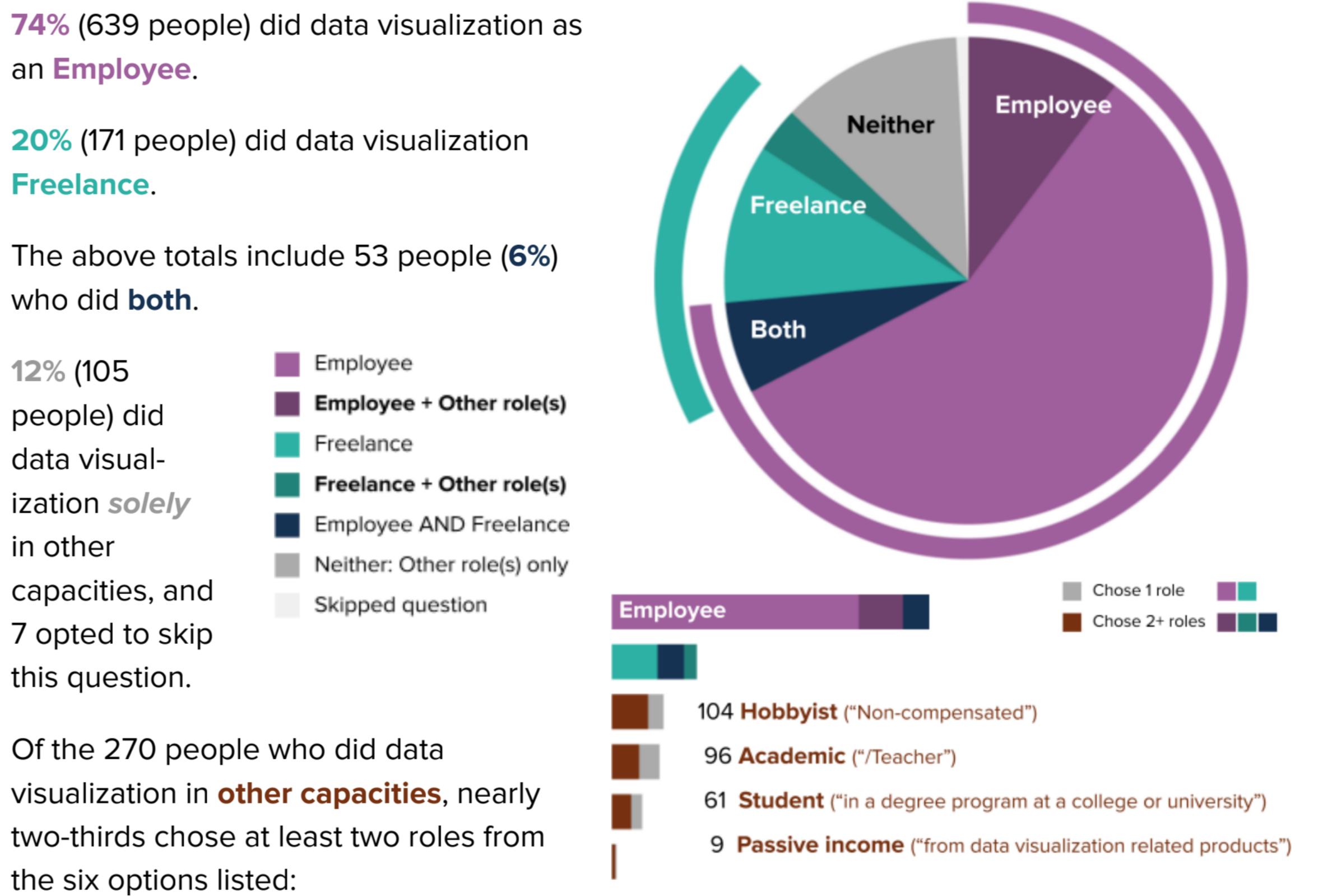
Figure 5 seems to fall under “Quadrant 4 - Confusing but Beautiful”
Some Quick Observations
The figure contains two different charts. Top: Dual pie chart. Bottom: Bar chart
Areas done well
In terms of Aesthetic
- Colours used is clear and distinct, and able to distinguish the different employment types.
Room for further improvement
In terms of Clarity
- Absence of chart title, value labels, proper annotations
- Legends were not placed next to (beside) the respective charts, which would not be easy for readers to interpret and understand.
- Employment categories could be confusing (e.g. “Employee”, “Employee + Other role(s)”, “Employee AND Freelance”).
In terms of Aesthetic
The two charts were placed too close to one another without proper demarcation. This could cause misinterpretation of the two separate charts as one chart.
Fill colour for missing values (skipped question) used was white (which could be easily mistaken as white space). Also, missing values could be filtered off for better analysis results.